

相関行列の相関係数を表にすることも多いと思います。しかし視覚に訴求する強力なツールとしてRで図を作成することができます。
それの一つが相関行列です。
Rではいくつものパッケージがあるので、そちらを使うこともできますが、シンプルにggplot2を使った方法を紹介します。
データの準備をします
相関行列を使います。デモのためにこの記事ではmtcarsのデータを使ってみます。
mtcarsとは
mtcarsは1974年にMotor Trends US Magazineという雑誌から抽出された、各車種における燃費などの車性能が入ったデータです。
mpg:燃費、cyl:気筒数、disp:排気量などのデータが入っています。
> mtcars
                     mpg cyl  disp  hp drat    wt  qsec vs am gear carb
Mazda RX4           21.0   6 160.0 110 3.90 2.620 16.46  0  1    4    4
Mazda RX4 Wag       21.0   6 160.0 110 3.90 2.875 17.02  0  1    4    4
Datsun 710          22.8   4 108.0  93 3.85 2.320 18.61  1  1    4    1
Hornet 4 Drive      21.4   6 258.0 110 3.08 3.215 19.44  1  0    3    1
Hornet Sportabout   18.7   8 360.0 175 3.15 3.440 17.02  0  0    3    2
Valiant             18.1   6 225.0 105 2.76 3.460 20.22  1  0    3    1
Duster 360          14.3   8 360.0 245 3.21 3.570 15.84  0  0    3    4
Merc 240D           24.4   4 146.7  62 3.69 3.190 20.00  1  0    4    2
Merc 230            22.8   4 140.8  95 3.92 3.150 22.90  1  0    4    2
Merc 280            19.2   6 167.6 123 3.92 3.440 18.30  1  0    4    4
Merc 280C           17.8   6 167.6 123 3.92 3.440 18.90  1  0    4    4
Merc 450SE          16.4   8 275.8 180 3.07 4.070 17.40  0  0    3    3
Merc 450SL          17.3   8 275.8 180 3.07 3.730 17.60  0  0    3    3
Merc 450SLC         15.2   8 275.8 180 3.07 3.780 18.00  0  0    3    3
Cadillac Fleetwood  10.4   8 472.0 205 2.93 5.250 17.98  0  0    3    4
Lincoln Continental 10.4   8 460.0 215 3.00 5.424 17.82  0  0    3    4
Chrysler Imperial   14.7   8 440.0 230 3.23 5.345 17.42  0  0    3    4
Fiat 128            32.4   4  78.7  66 4.08 2.200 19.47  1  1    4    1
Honda Civic         30.4   4  75.7  52 4.93 1.615 18.52  1  1    4    2
Toyota Corolla      33.9   4  71.1  65 4.22 1.835 19.90  1  1    4    1
Toyota Corona       21.5   4 120.1  97 3.70 2.465 20.01  1  0    3    1
Dodge Challenger    15.5   8 318.0 150 2.76 3.520 16.87  0  0    3    2
AMC Javelin         15.2   8 304.0 150 3.15 3.435 17.30  0  0    3    2
Camaro Z28          13.3   8 350.0 245 3.73 3.840 15.41  0  0    3    4
Pontiac Firebird    19.2   8 400.0 175 3.08 3.845 17.05  0  0    3    2
Fiat X1-9           27.3   4  79.0  66 4.08 1.935 18.90  1  1    4    1
Porsche 914-2       26.0   4 120.3  91 4.43 2.140 16.70  0  1    5    2
Lotus Europa        30.4   4  95.1 113 3.77 1.513 16.90  1  1    5    2
Ford Pantera L      15.8   8 351.0 264 4.22 3.170 14.50  0  1    5    4
Ferrari Dino        19.7   6 145.0 175 3.62 2.770 15.50  0  1    5    6
Maserati Bora       15.0   8 301.0 335 3.54 3.570 14.60  0  1    5    8
Volvo 142E          21.4   4 121.0 109 4.11 2.780 18.60  1  1    4    2
>
相関行列の生成
相関行列を生成してみます。
mtcarsのデータからSpearmanの順位相関係数をみてみます。またggplot2で使いやすいようにデータを変形していきます。相関はcorで計算をしており、その中のmethodでspearmanと指定しています。
縦のデータへの変換はpivot_longerを用いています。pivot_longerは次の記事に詳しい説明があります。

# tidyverseの起動
library(tidyverse)

#mtcars
a <- mtcars

#相関行列(Spearman)
cormat <- cor(a, method = "spearman")

#データフレーム化
df <- data.frame(cormat) %>%

#列名の抽出
tibble::rownames_to_column(var = "Y")

#縦のデータへ
df.long <- pivot_longer(df,
                            cols = mpg:carb,
                            names_to = "X",
                            values_to = "rho")

#データの確認
> head(df.long)
# A tibble: 6 x 3
  Y     X        rho
  <fct> <fct>  <dbl>
1 mpg   mpg    1
2 mpg   cyl   -0.911
3 mpg   disp  -0.909
4 mpg   hp    -0.895
5 mpg   drat   0.651
6 mpg   wt    -0.886
>
以上のようなデータになりました。自分のデータで相関行列があればそれを縦のデータに変換して利用することができます。
geom_tileを使って相関行列のヒートマップを描く
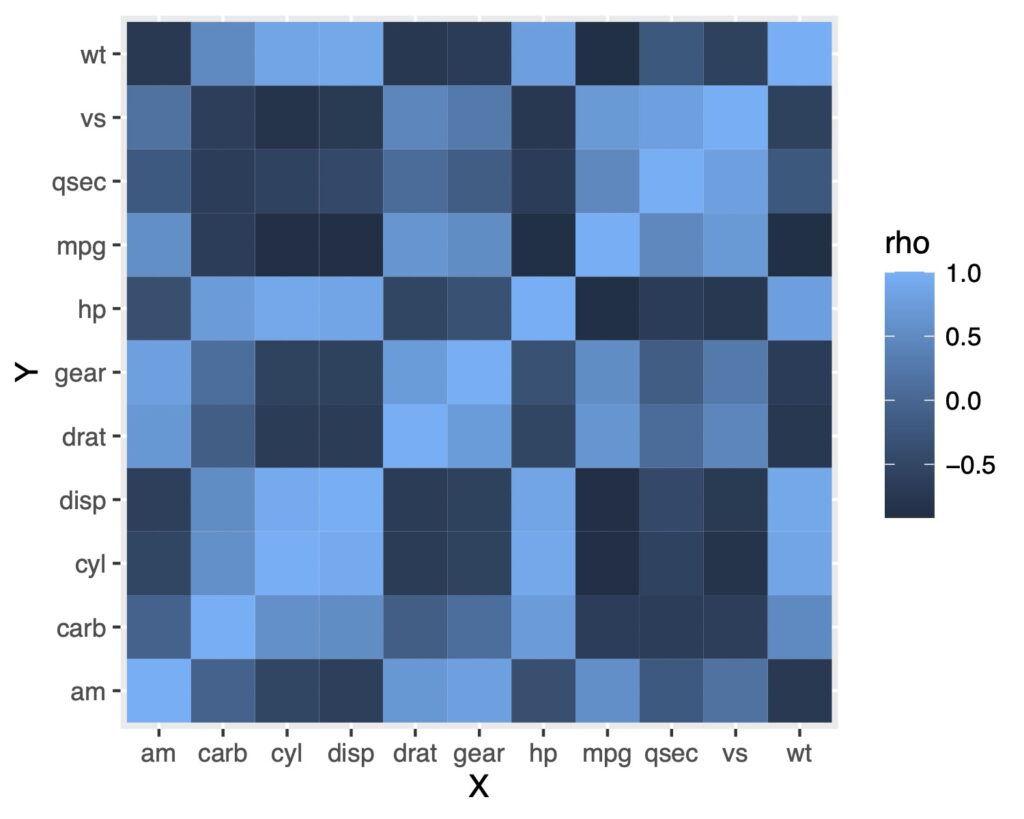
geom_tile()を使うことで視覚化することができます。
次のようになります。
geom_tile()を使う
ggplot(df.long, aes(x = X, y = Y, fill = rho)) +
  geom_tile()
scale_fill_gradientで色の変更をする
色を変更してみます。よく見るのは値の高いところが赤、低いところが青ですよね?
scale_fill_gradient2を使ってみます。
ggplot(df.long, aes(x = X, y = Y, fill = rho)) +
  geom_tile(color = "white") +
  scale_fill_gradient2(low = "blue", high = "red", mid = "white",
                       midpoint = 0, limit = c(-1, 1),
                       name = "Rho", space = "Lab")
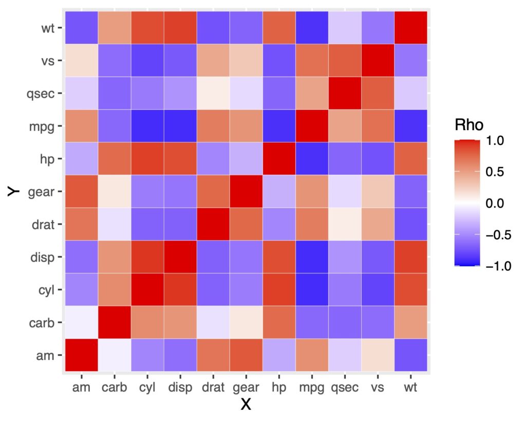
これで出来ました!
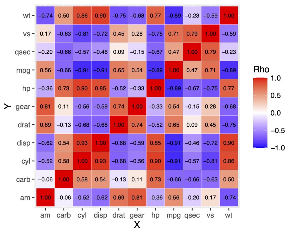
ところでここに数値を入れたい人もいるかもしれません。
ヒートマップの中に数値を表示する
数値を入れるにはgeom_text()で出来ます!
df.long %>%
  ggplot(aes(x = X, y = Y, fill = rho)) +
  geom_tile(color = "white") +
  scale_fill_gradient2(low = "blue", high = "red", mid = "white",
                       midpoint = 0, limit = c(-1, 1), name = "Rho", space = "Lab")+
  geom_text(aes(label = sprintf("%0.2f", rho)),
            color = "black", size = 2.5)
軸ラベルの順番を変える
軸ラベルがアルファベット順になっていることに気がついたでしょうか。
これが不便に感じるときがあります。そういうときはfactor(data, levels = )で軸ラベルの順番を指定すれば解決です。
lbs <- df[,1]
df.long$X <- factor(df.long$X, levels = lbs)
df.long$Y <- factor(df.long$Y, levels = lbs)

df.long %>%
  ggplot(aes(x = X, y = Y, fill = rho)) +
  geom_tile(color = "white") +
  scale_fill_gradient2(low = "blue", high = "red", mid = "white",
                       midpoint = 0, limit = c(-1, 1), name = "Rho", space = "Lab")+
  geom_text(aes(label = sprintf("%0.2f", rho)),
            color = "black", size = 2.5)
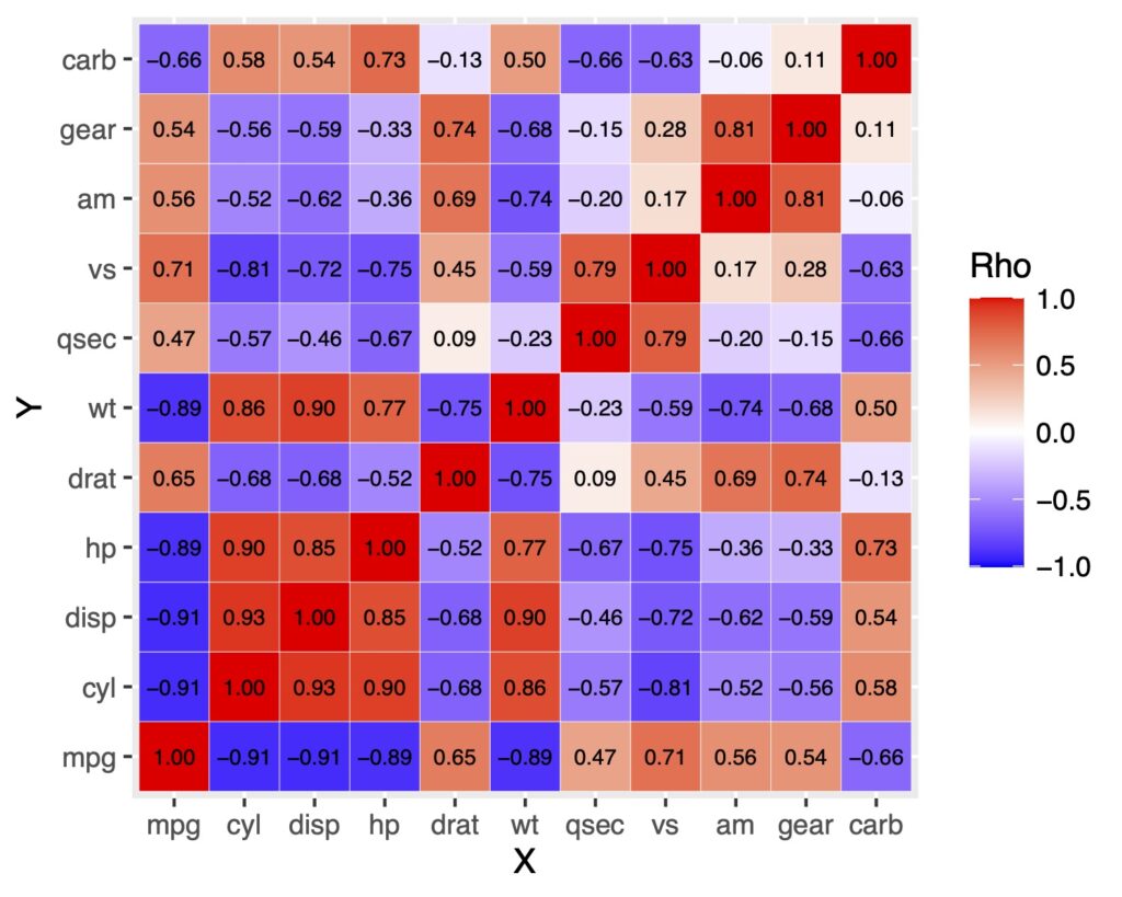
順番はdata <- factor(data, levels = c(“mpg”, “cyl”, “disp”, ….))というように一つ一つ指定することもできます。
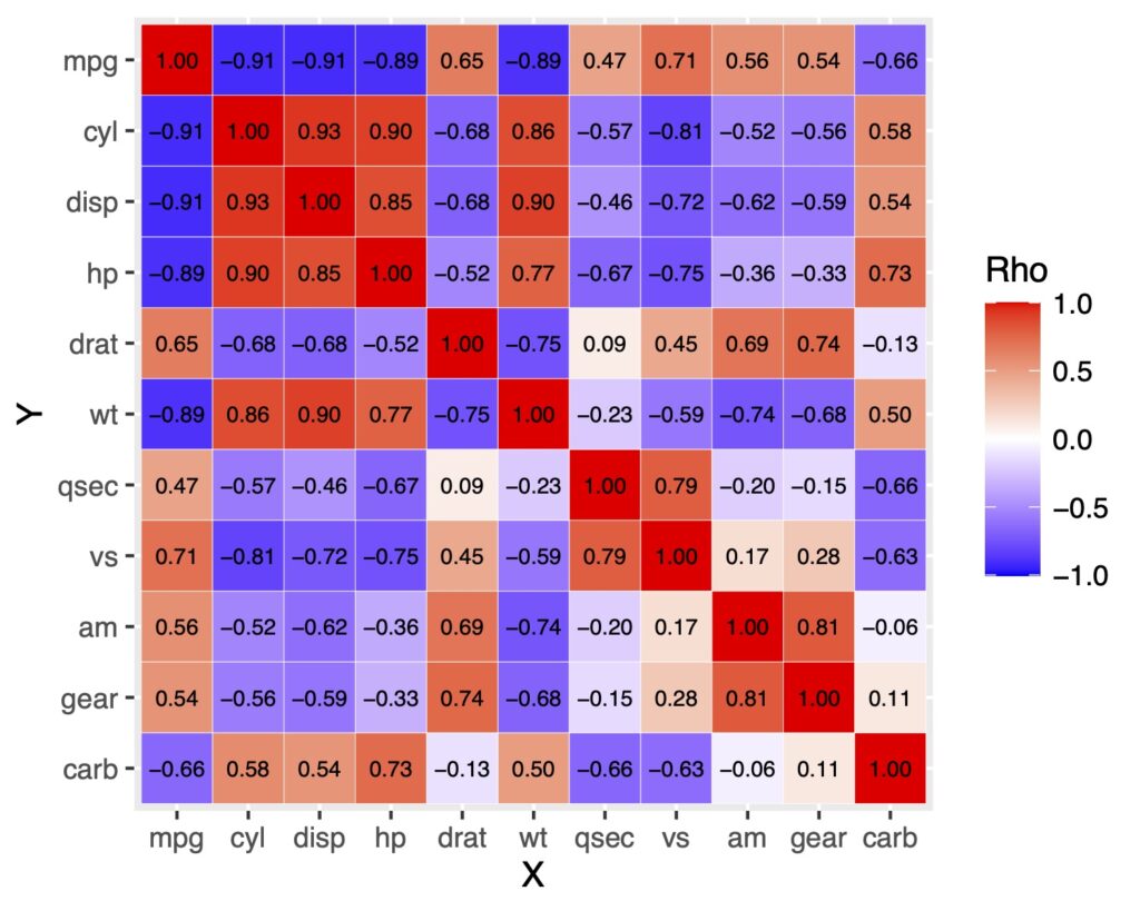
y軸を反転させる
上のグラフは左下からラベルが並んでいます。y軸は上からはじまって欲しい場合があります。
そういうときはy軸の並びを反転させます。
scale_y_discrete(limits = rev(levels( )))で反転できます。
df.long %>%
  ggplot(aes(x = X, y = Y, fill = rho)) +
  geom_tile(color = "white") +
  scale_fill_gradient2(low = "blue", high = "red", mid = "white",
                       midpoint = 0, limit = c(-1, 1), name = "Rho", space = "Lab")+
  geom_text(aes(label = sprintf("%0.2f", rho)),
            color = "black", size = 2.5)+
  scale_y_discrete(limits = rev(levels(df.long$Y)))
三角行列で表示をしたい時
上の図では対角線で対称になっていますが、余計な情報だと思うかもしれません。それであれば三角行列にしてみます。
ただし、ggplotで三角行列にするというより、データ自体を三角行列になるようにしていきます。
上三角行列
上三角行列にするには下の部分をNAにして、その部分を空欄にします。
# 上三角行列にするためのfunction
# 下にはNAを代入する
get_upper_tri <- function(cormat){
  cormat[lower.tri(cormat)]<- NA
  return(cormat)
}

# 実際のデータに適応
upper_tri <- get_upper_tri(cormat)

# データの変形
df_upper_tri <- data.frame(upper_tri) %>%
  tibble::rownames_to_column(var = "Y")

df_upper_tri.long <- pivot_longer(df_upper_tri,
                        cols = mpg:carb,
                        names_to = "X",
                        values_to = "rho")

# ラベルの並び替え
lbs2 <- df_upper_tri[,1]
df_upper_tri.long$X <- factor(df_upper_tri.long$X, levels = lbs2)
df_upper_tri.long$Y <- factor(df_upper_tri.long$Y, levels = lbs2)

# 作図
df_upper_tri.long %>%
  ggplot(aes(x = X, y = Y, fill = rho)) +
  geom_tile(color = "white") +
  scale_fill_gradient2(low = "blue", high = "red", mid = "white",
                       midpoint = 0, limit = c(-1, 1),
                       name = "Rho", space = "Lab",
                       na.value = "white")+
  geom_text(aes(label = ifelse(is.na(rho) | rho %in% "",NA, sprintf("%0.2f", rho))),
            color = "black", size = 4.5)+
  scale_y_discrete(limits = rev(levels(df_upper_tri.long$Y)))+
  theme_classic()
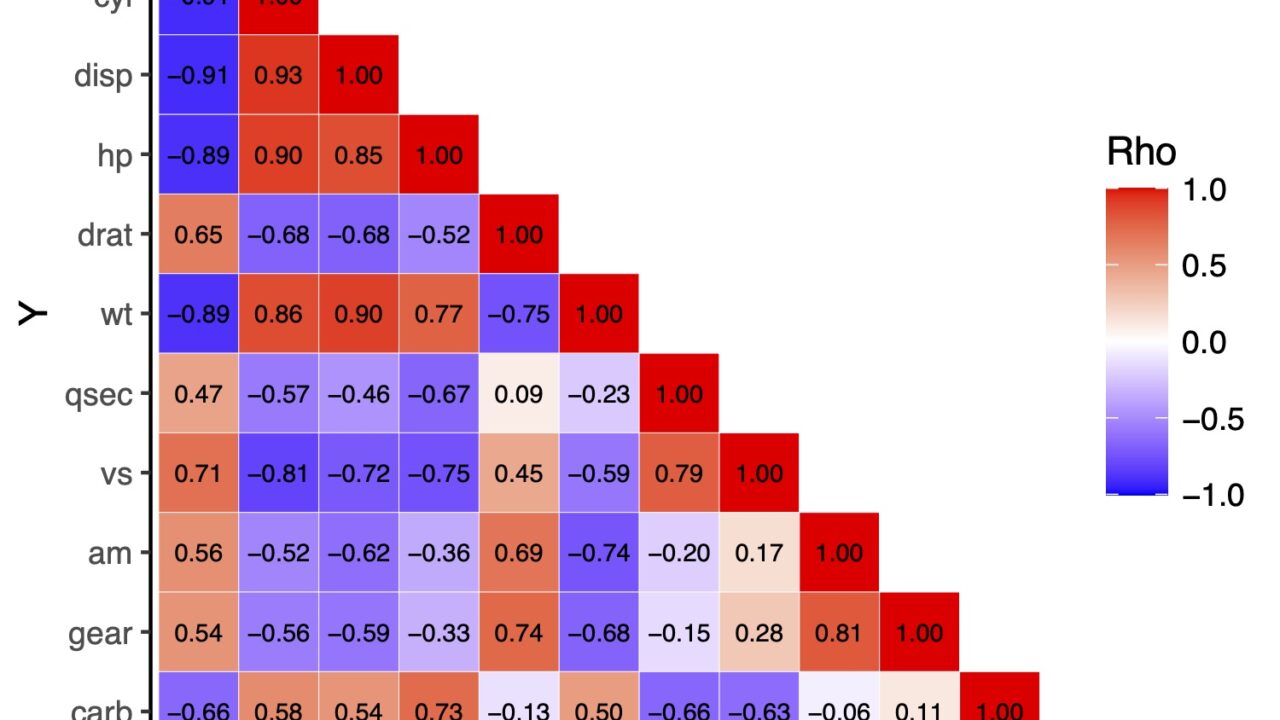
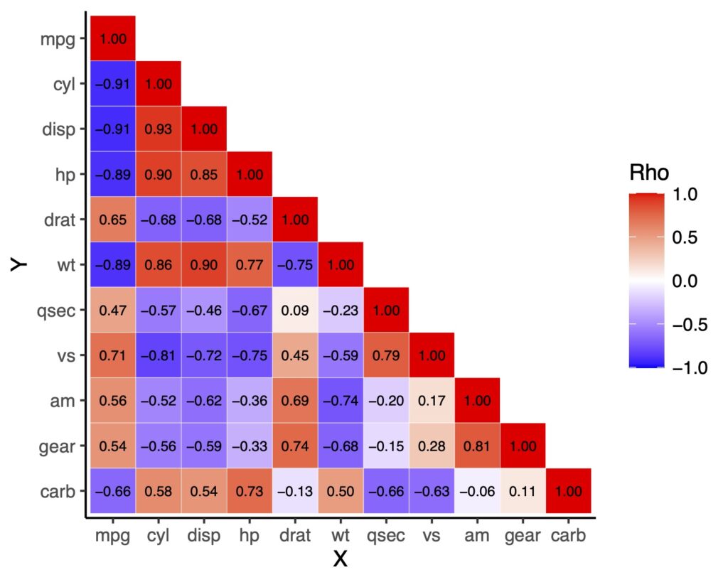
下三角行列
下三角も同様に出来ます。
# 下三角行列にするためのfunction
# 上にはNAを代入する
get_lower_tri <- function(cormat){
  cormat[upper.tri(cormat)]<- NA
  return(cormat)
}

# 実際のデータに適応
lower_tri <- get_lower_tri(cormat)

# データの変形
df_lower_tri <- data.frame(lower_tri) %>%
  tibble::rownames_to_column(var = "Y")

df_lower_tri.long <- pivot_longer(df_lower_tri,
                                  cols = mpg:carb,
                                  names_to = "X",
                                  values_to = "rho")

# ラベルの並び替え
lbs3 <- df_lower_tri[,1]
df_lower_tri.long$X <- factor(df_lower_tri.long$X, levels = lbs3)
df_lower_tri.long$Y <- factor(df_lower_tri.long$Y, levels = lbs3)

# 作図
df_lower_tri.long %>%
  ggplot(aes(x = X, y = Y, fill = rho)) +
  geom_tile(color = "white") +
  scale_fill_gradient2(low = "blue", high = "red", mid = "white",
                       midpoint = 0, limit = c(-1, 1),
                       name = "Rho", space = "Lab",
                       na.value = "white")+
  geom_text(aes(label = ifelse(is.na(rho) | rho %in% "",NA, sprintf("%0.2f", rho))),
            color = "black", size = 2.5)+
  scale_y_discrete(limits = rev(levels(df_lower_tri.long$Y)))+
  theme_classic()
ifelseの使い方が初心者には難しいかもしれませんが、慣れれば特定の閾値以下は表示しない、などのテクニックなども使えます。
便利なグラフなので、覚えて損はありません。お役に立ちましたら幸いです。