
The ‘T’ symbol on bar graphs and line graphs represents error bars that extend above and below the data point, indicating standard error or standard deviation. Adding error bars in R’s ggplot2 is easy. Here’s a step-by-step guide:
Preparing the Data
We’ll be using tidyverse for this. If you have your own data, skip ahead.
# Set working directory
setwd("~/Rpractice/")

# Load tidyverse
library(tidyverse)

# Generate random data
dat <- list(
  X <- rnorm(50, 30, 10),
  Y <- rnorm(50, 50, 5),
  Z <- rnorm(50, 40, 15)
)
df <- data.frame(matrix(unlist(dat), nrow=50))
colnames(df) <- c("A","B","C")

# Transform the data from wide to long
df.long <- pivot_longer(df, cols = A:C,
                        names_to = "Categories",
                        values_to = "Values")
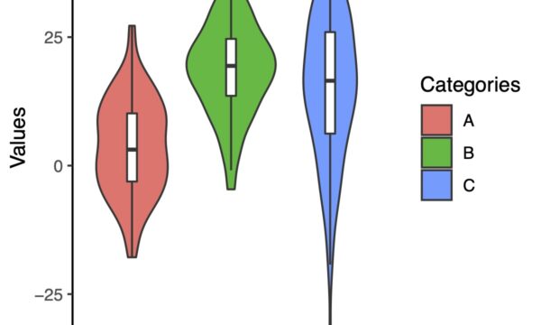
Now we have data that looks like this:
> head(df.long)
# A tibble: 6 x 2
  Categories Values
  <chr>       <dbl>
1 A            26.8
2 B            53.7
3 C            27.3
4 A            31.0
5 B            58.7
6 C            56.2
>
To add error bars to bar graphs and line graphs, you need the mean and standard error (or standard deviation) of the data. We use pivot_longer to transform the data from wide to long format.”
Calculating the Mean, Standard Deviation, and Standard Error of the Data
To add error bars, we need to calculate the mean, standard deviation, and standard error. If you already have this data, you can skip this section.
Calculating these values is easy with the dplyr package in tidyverse.
Use group_by and summarise_all functions in dplyr to Calculate
a <- group_by(df.long, Categories) %>%
  summarise_all(list(mean = ~mean(.),
                     sd = ~sd(.),
                     se = ~sd(.)/sqrt(length(.))))
We can simplify this code further,
a <- group_by(df.long, Categories) %>%
  summarise_all(list(mean = mean,
                     sd = sd,
                     se = ~sd/sqrt(length(.))))
Let’s take a look at the data for ‘a’
> a
# A tibble: 3 x 4
  Categories  mean    sd    se
  <chr>      <dbl> <dbl> <dbl>
1 A           30.1  9.93 1.40
2 B           49.2  5.00 0.708
3 C           43.9 15.5  2.20
We have generated a distribution that looks like this. Since the data was generated randomly, the values may vary slightly if you follow the same steps.
Drawing Error Bars in Bar Graphs
We will use the calculated data to create a bar graph and specify the error bars using geom_errorbar(). First, let’s specify only ymin and ymax in geom_errorbar() and take a look at the graph.
ggplot(a, aes(x = Categories, y = mean, fill = Categories))+
  geom_bar(stat = "identity") +
  geom_errorbar(aes(ymin = mean - se, ymax = mean + se))
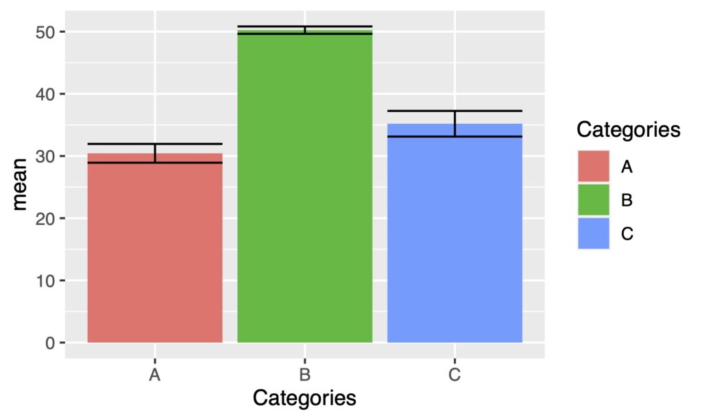
The width is too wide. Let’s adjust it using the width argument. We will narrow both the bar graph and error bars.
ggplot(a, aes(x = Categories, y = mean, fill = Categories))+
  geom_bar(stat = "identity", width = 0.6) +
  geom_errorbar(aes(ymin = mean - se, ymax = mean + se),
                width = .1)
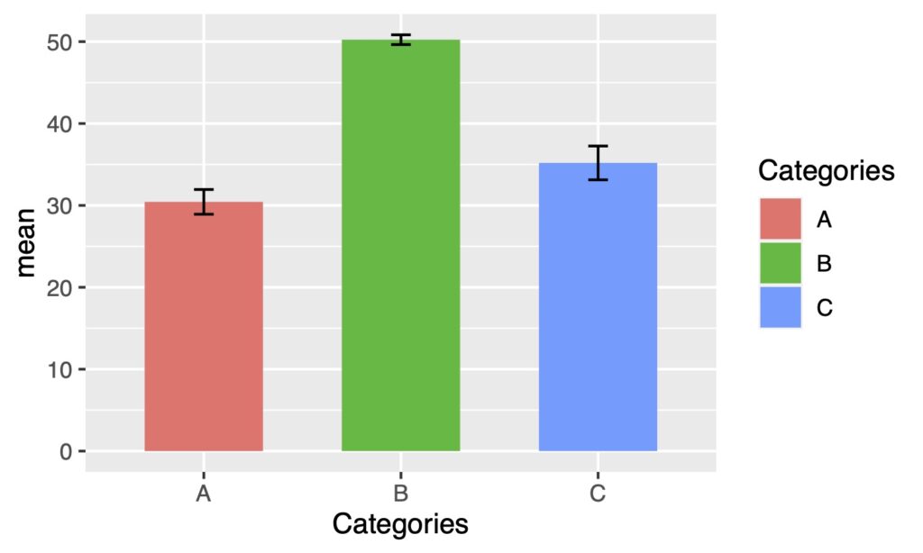
It’s a good to adjust the width according to the size of the output image.
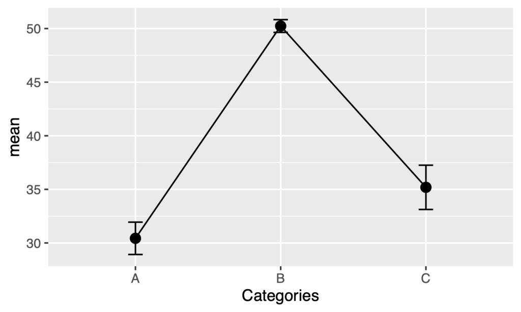
Drawing Error Bars on a Line Graph
The process for adding error bars to a line graph is the same as above. First, draw the line graph and then add geom_errorbar().
ggplot(a, aes(x = Categories, y = mean)) +
  geom_line(group = 1) +
  geom_point(size = 3) +
  geom_errorbar(aes(ymin = mean - se, ymax = mean + se),
                width = .1)
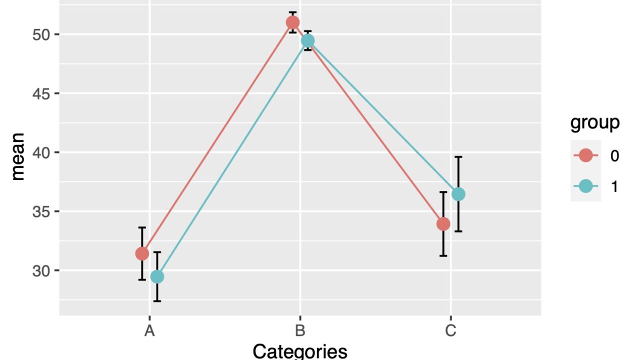
Adding Error Bars to Grouped Data
Let’s generate grouped data.
<pre class="wp-block-syntaxhighlighter-code"># Add ID column
data <- df.long %>%
  tibble::rownames_to_column(var = "ID")

# Convert ID from character to numeric
data$ID <- as.numeric(data$ID)

# Assign 1 to ID <= 75 and 0 to ID >= 76 to create the "group" column
data <- mutate(data, group = ifelse(ID < 76, 1, 0))

# Calculate Mean, SD, and SE
b <- group_by(data, group, Categories) %>%
  summarise_at(vars(Values), list(mean = ~mean(.),
                     sd = ~sd(.),
                     se = ~sd(.)/sqrt(length(.))))

# Convert group column values from numeric to character
b$group <- as.character(b$group)

# Check the data included in b
> head(b)
# A tibble: 6 x 5
# Groups:   group <img class="ranking-number" src="https://brain-storm.space/wp-content/themes/jin/img/rank02.png" />
  group Categories  mean    sd    se
  <chr> <chr>      <dbl> <dbl> <dbl>
1 0     A           31.4 11.1  2.21
2 0     B           51.0  4.31 0.862
3 0     C           33.9 13.5  2.70
4 1     A           29.5 10.4  2.08
5 1     B           49.5  4.02 0.804
6 1     C           36.5 15.8  3.16
> </pre>
Now that we have grouped data, let’s draw a bar graph with error bars.
Adding Error Bars to Grouped Bar Graphs
By specifying position = "dodge", you can create a grouped bar chart like this.
ggplot(b, aes(x = Categories, y = mean, fill = group))+
  geom_bar(stat = "identity", width = 0.6, position = "dodge")
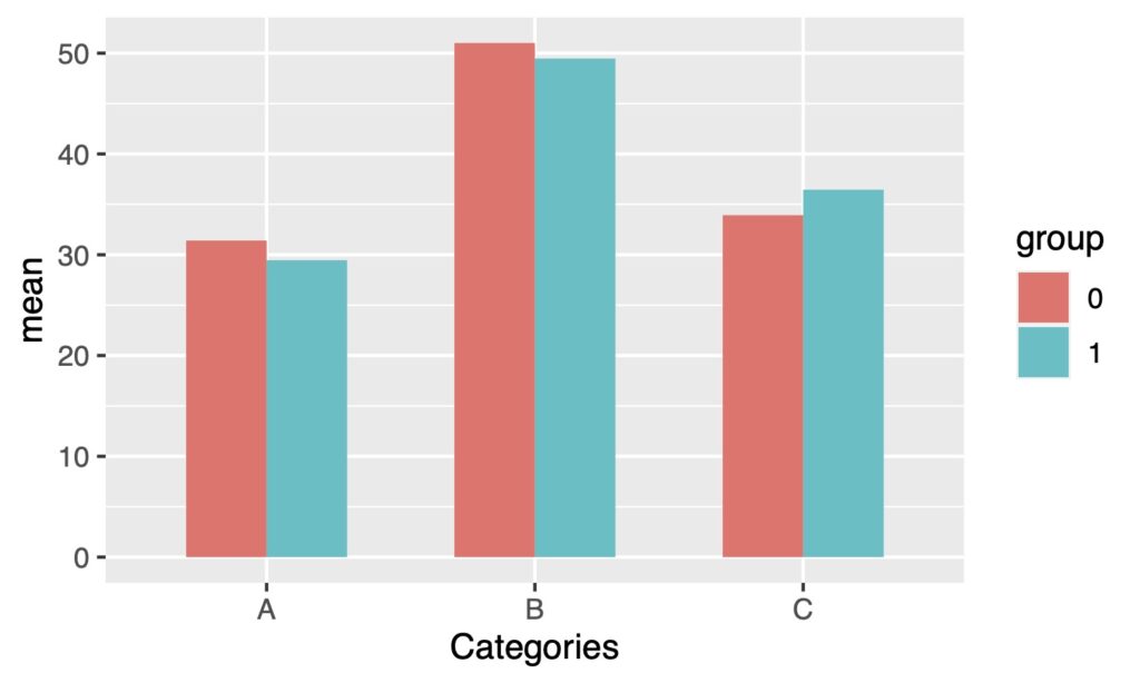
Let’s add error bars to this plot.
ggplot(b, aes(x = Categories, y = mean, fill = group))+
  geom_bar(stat = "identity", width = 0.6, position = "dodge")+
  geom_errorbar(aes(ymin = mean - se, ymax = mean + se),
                    position = "dodge", width = .1)

It is shifted to the center. You can adjust the position with position = position_dodge().
ggplot(b, aes(x = Categories, y = mean, fill = group)) +
  geom_bar(stat = "identity", width = 0.6, position = "dodge") +
  geom_errorbar(aes(ymin = mean - se, ymax = mean + se),
                position = position_dodge(0.6), width = .1)

You’ve created a nice bar graph!
Drawing Error Bars on a Grouped Line Graph
The same can be done for a grouped line graph as well.
ggplot(b, aes(x = Categories, y = mean, group = group, color = group)) +
  geom_line() +
  geom_point(size = 3) +
  geom_errorbar(aes(ymin = mean - se, ymax = mean + se),
                width = .1, color = "black")
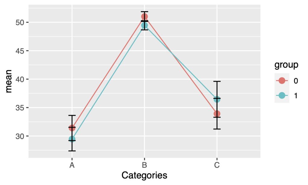
The error bars are on top and overlapping, making it difficult to see. Let’s move the error bars to the back first.
ggplot(b, aes(x = Categories, y = mean, group = group, color = group)) +
  geom_errorbar(aes(ymin = mean - se, ymax = mean + se),
                width = .1, color = "black") +
  geom_line() +
  geom_point(size = 3)
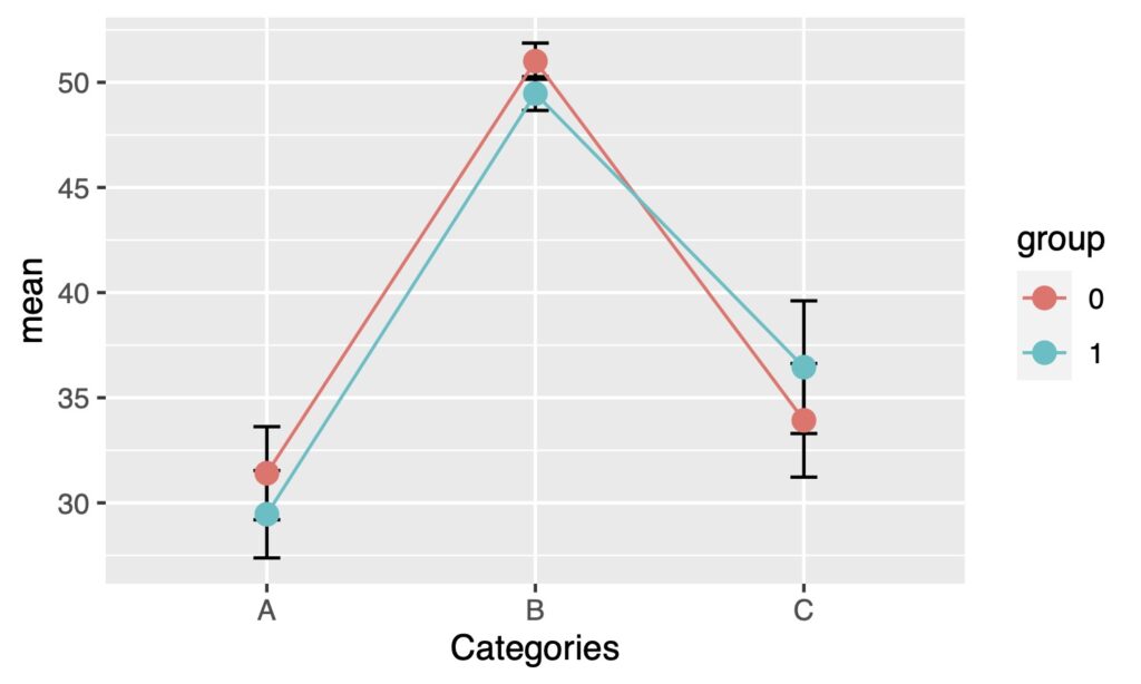
By shifting the position to the left or right using position_dodge(), overlapping of error bars can be avoided.
ggplot(b, aes(x = Categories, y = mean, group = group, color = group)) +
  geom_errorbar(aes(ymin = mean - se, ymax = mean + se),
                width = .1, color = "black", position = position_dodge(.2)) +
  geom_line(position = position_dodge(.2)) +
  geom_point(size = 3, position = position_dodge(.2))
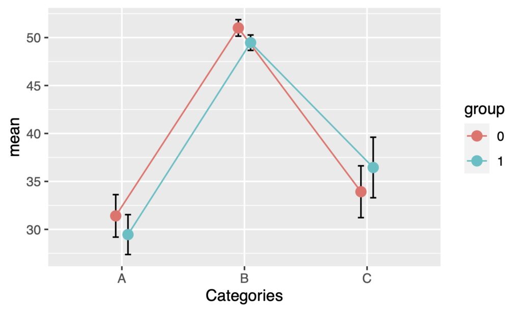
Now you can add error bars to line graphs. I hope this was helpful.