

I will introduce how to draw an ROC curve. In R, it is very easy to draw an ROC curve. There are many libraries available for drawing ROC curves, but this time I will introduce how to draw it using the pROC library, which is commonly used and easy to use.
Creating Sample Data
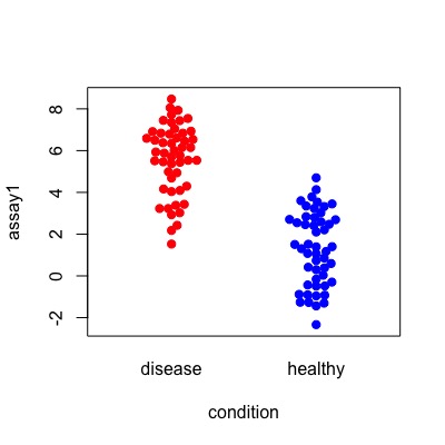
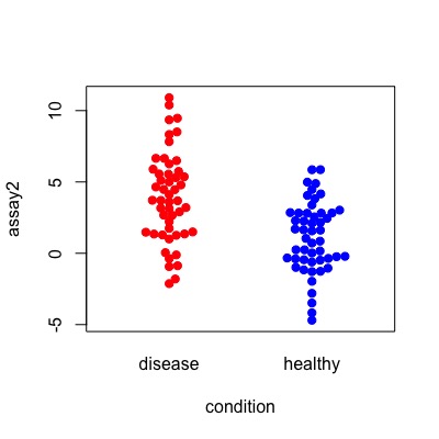
This section is about creating sample data. If you don’t need it, please skip to the next section. Let’s consider how well we can detect people with the disease using two assays, “assay1” and “assay2”.
set.seed(3)
condition <- rep(c("healthy", "disease"), each = 50)
assay1 <- c(rnorm(40, mean = 1, sd = 2),
            rnorm(10, mean = 3, sd = 1),
            rnorm(40, mean = 5, sd = 2),
            rnorm(10, mean = 7, sd = 1))
assay2 <- c(rnorm(30, mean = 1, sd = 3),
            rnorm(20, mean = 2, sd = 2),
            rnorm(30, mean = 3, sd = 3),
            rnorm(20, mean = 4, sd = 2))

df = data.frame(condition, assay1, assay2)
these distributions would look like this:
library(beeswarm)
beeswarm(data = df, assay1 ~ condition,
         col = c("red","blue"), pch=19)
beeswarm(data = df, assay2 ~ condition,
         col = c("red", "blue"), pch=19)
Use pROC
Install pROC package
First, you need to install and load the pROC package to use it in R.
install.packages("pROC")
library(pROC)
To draw a single ROC curve
The data frame looks like this:
> head(df)
  condition     assay1     assay2
1   healthy -0.9238668  2.8520501
2   healthy  0.4149486 -0.2152325
3   healthy  1.5175764  4.1593113
4   healthy -1.3042638  2.8068527
5   healthy  1.3915657  4.0523835
6   healthy  1.0602479  2.8245020
There are several ways to proceed from here, but first let’s use roc() to store the result in an object.
roc1 <- roc(condition, assay1, data=df, ci=TRUE,
            levels=c("healthy", "disease"))
As an alternative, you can also use the following notation with “~”:
roc1 <- roc(df$condition ~ df$assay1, ci=TRUE,
            levels=c("healthy", "disease"))
The condition column can be 0 and 1, as it is a binary variable. ci refers to the confidence interval.
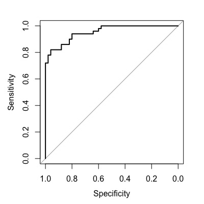
you can use the plot() function to draw the ROC curve.
plot(roc1)
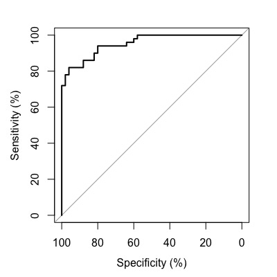
Convert to Percentage Display
You can customize the axis to display in percentage format by adding percent=TRUE.
roc1 <- roc(condition, assay1, data=df, percent=TRUE,
            levels=c("healthy", "disease"))
plot(roc1)
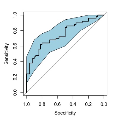
Display Confidence Interval of Sensitivity
You can display the confidence interval of the sensitivity. To calculate the confidence interval of sensitivity, use ci.se(). col is used to specify the color.
roc2 <- roc(condition, assay2, data=df, ci=TRUE,
            levels=c("healthy", "disease"))
plot(roc2)
rocCI <- ci.se(roc2)
plot(rocCI, type="shape", col="lightblue")
Display Optimal Cutoff Point
One important aspect of the ROC curve is determining the optimal cut-off point. While determining the optimal cut-off point is a big topic on its own, here we introduce two methods: the Youden Index and top left.
To explain briefly, the Youden Index is calculated as “sensitivity + specificity – 1”, and the point with the highest value is selected as the optimal cut-off point. On the other hand, the top left method extracts the point closest to the upper left corner of the ROC curve.
display Optimal Cutoff based on Youden Index
You can add the optimal cutoff to the plot by modifying the plot() function call. Setting print.thres = "best" and print.thres.best.method = "youden" will display the optimal point. Setting legacy.axes = TRUE will make the x-axis display as 1-Specificity.
plot(roc1, main = "ROC Curve",
     identity = TRUE,
     print.thres = "best",
     print.thres.best.method = "youden",
     legacy.axes = TRUE)
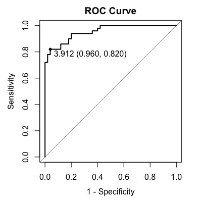
The optimal cut-off point in this case is 3.912 with sensitivity of 0.820 and specificity of 0.960.
Display Optimal Cutoff using Top Left Method
In the case of top left, set print.thres.best.method="closest.topleft" in plot() function.
plot(roc1, main = "ROC Curve",
     identity = TRUE,
     print.thres = "best",
     print.thres.best.method = "closest.topleft"
     legacy.axes = TRUE)
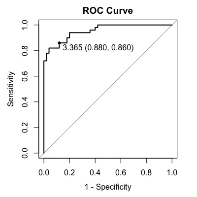
Note that in this case, the optimal cutoff is 3.365, with a sensitivity of 0.860 and specificity of 0.880.
Extracting Necessary Values
When presenting or publishing the values of AUC (area under the curve), sensitivity, specificity, etc., you can display them as follows.
> auc(roc1)
Area under the curve: 0.9536

# youden
> coords(roc1, "best", ret=c("threshold", "sens", "spec", "ppv", "npv"))
          threshold sensitivity specificity       ppv       npv
threshold  3.912407        0.82        0.96 0.9534884 0.8421053

# topleft
> coords(roc1, "best", best.method="closest.topleft", ret=c("threshold", "sens", "spec", "ppv", "npv"))
          threshold sensitivity specificity      ppv       npv
threshold  3.364778        0.86        0.88 0.877551 0.8627451
Comparing two ROC curves by overlapping them
We have created sample data assuming two tests. Let’s see which test is better by comparing the two ROC curves.
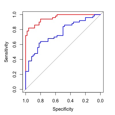
Overlay Two ROC Curves
When overlapping two ROC curves, you can use the lines() function for the one that you want to add later, or simply use plot(..., add=TRUE) for the second curve. You can specify the color using col.
# Use roc() to create objects for the two assays
roc1 <- roc(condition, assay1, data=df, ci=TRUE,
            levels=c("healthy", "disease"))
roc2 <- roc(condition, assay2, data=df, ci=TRUE,
            levels=c("healthy", "disease"))

# Use lines()
obj1 <- plot(roc1,
             col="red")
obj2 <- lines(roc2,
              col="blue")

# Use add = TRUE
obj1 <- plot(roc1,
             col="red")
obj2 <- plot(roc2,
             col="blue",
             add=TRUE)
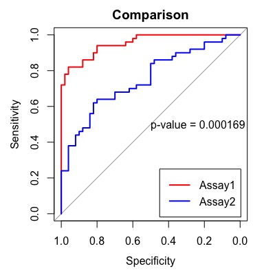
Compare Two Assays
o compare two assays, use roc.test(). By default, it compares the AUCs (area under the curve) using the DeLong method, but you can change it to the bootstrap method by specifying method = "bootstrap". The p-value is displayed in the center using text(). You can also specify the title using main=.
roc1 <- roc(condition, assay1, data=df, ci=TRUE,
            levels=c("healthy", "disease"))
roc2 <- roc(condition, assay2, data=df, ci=TRUE,
            levels=c("healthy", "disease"))

obj1 <- plot(roc1,
             main="Comparison",
             col="red")
obj2 <- lines(roc2,
              col="blue")
obj <- roc.test(obj1, obj2)
text(.5, .5, labels=paste("p-value =", format.pval(obj$p.value, 3)),
     adj=c(0, .5))
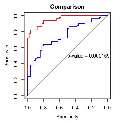
If you just want to see the comparison results, roc.test() will provide you with the results.
> roc.test(roc1, roc2)

	DeLong's test for two correlated ROC curves

data:  roc1 and roc2
Z = 3.7621, p-value = 0.0001685
alternative hypothesis: true difference in AUC is not equal to 0
95 percent confidence interval:
 0.0969536 0.3078464
sample estimates:
AUC of roc1 AUC of roc2
     0.9536      0.7512
Finally, let’s add a legend.
roc1 <- roc(condition, assay1, data=df, ci=TRUE,
            levels=c("healthy", "disease"))
roc2 <- roc(condition, assay2, data=df, ci=TRUE,
            levels=c("healthy", "disease"))

obj1 <- plot(roc1,
             main="Comparison",
             col="red")
obj2 <- lines(roc2,
              col="blue")

obj <- roc.test(obj1, obj2)

# p values in the graph
text(.5, .5, labels=paste("p-value =", format.pval(obj$p.value, 3)),
     adj=c(0, .5))

#legend
legend("bottomright", legend=c("Assay1", "Assay2"),
       col=c("red", "blue"), lty=1, lwd=2)
That was a helpful tutorial on how to draw ROC curves in R using the pROC package. Thank you for sharing!