

ggplot2でドットプロットを紹介しましたが、ggplot2でbeeswarmに出来ないでしょうか、という質問をいただきました。
今回はggplot2でbeeswarmを描く方法を紹介します。ggbeeswarmというパッケージを使えばできます。
過去にggplot2を使ったドットプロットの書き方と、ggplot2を使わずbeeswarmパッケージを使った方法を紹介しています。それについてはこちらを参考にしてください。
それでは早速ggplot2でbeeswarmを書いていきましょう。
データ準備とパッケージのインストール
まずはtidyverseとggbeeswarmをいれていきます。ggplot2はtidyverseの中に入っています。
まずは作業ディレクトリの設定
setwd("~/Rpractice/")
ggbeeswarmをCRANからインストールをします。
tidyverseやgglot2はすでにインストールされている前提ですすめていきますね。
install.packages("ggbeeswarm")
それではパッケージを起動します
library(tidyverse)
library(ggbeeswarm)
アヤメデータを使います
アヤメはアヤメ科の植物ですが、英語でiris(アイリス)といいます
ギリシャ語の虹(イリス)に由来するそうです
#irisデータをaに格納
a <- iris
#ボックスプロットを描画
ggplot(a, aes(x = Species, y = Sepal.Length, fill = Species))+
  geom_boxplot(fill = "white")+
  theme_classic()
ggbeeswarmのgeom_beeswarmを使う
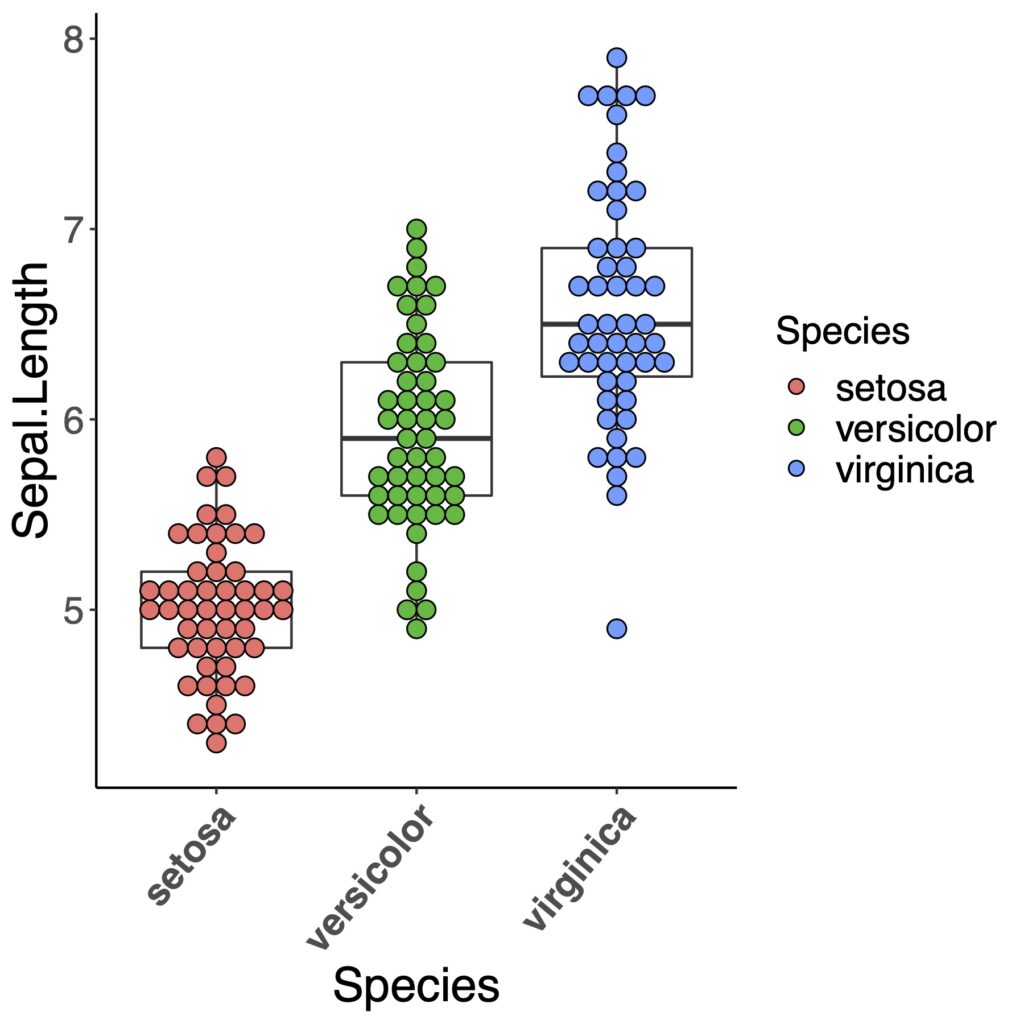
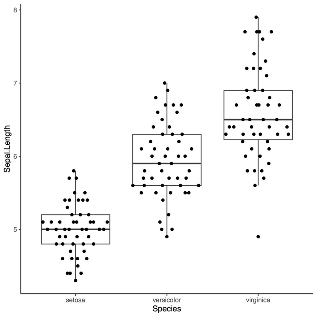
ggbeeswarmを使っていないドットプロット
以前の記事でggplotを用いて書いた図です。ggplotでのボックスプロットはこちらを参考にしてください。
ggplot(a, aes(x = Species, y = Sepal.Length, fill = Species))+
  geom_boxplot(fill = "white")+
  geom_dotplot(binaxis = "y", binwidth = 0.1, stackdir = "center")+
  theme_classic()+
  theme(axis.text.x = element_text(angle = 50, vjust = 1, size = 16, hjust = 1, face = "bold"),
        axis.text.y = element_text(hjust = 1, size = 16),
        axis.title.x = element_text(size = 20),
        axis.title.y = element_text(size = 20),
        legend.title = element_text(size =16),
        legend.text = element_text(size =16))
それではggbeeswarmを使っていきたいと思います。
geom_beeswarmを使う
geom_beeswarmを使ってみましょう。
ggplot(a, aes(x=Species, y=Sepal.Length))+
  geom_boxplot(fill="white")+
  geom_beeswarm()+
  theme_classic()
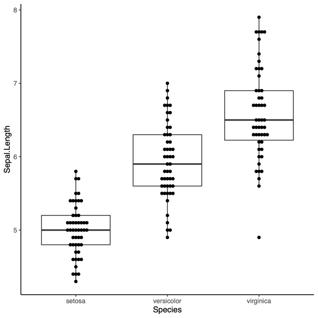
いまいちですね。色をつけてみます。
ggplot(a, aes(x=Species, y=Sepal.Length))+
  geom_boxplot(fill="white")+
  geom_beeswarm(aes(color = Species))+
  theme_classic()
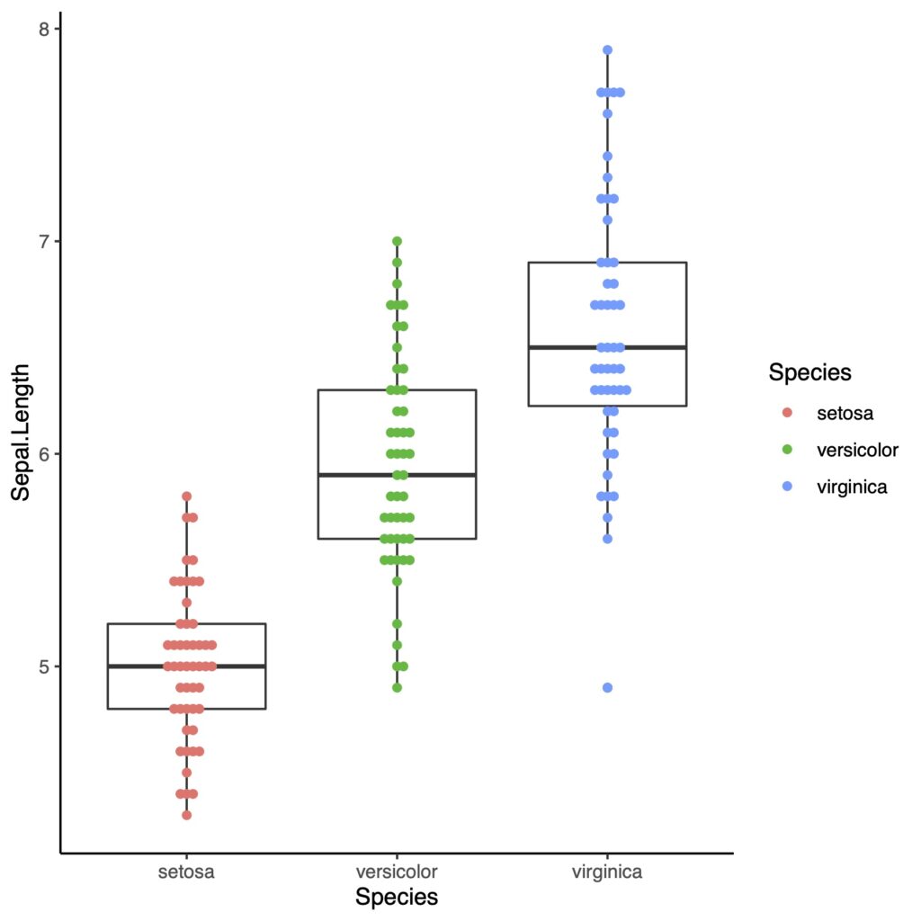
点が小さいし、点どうしが重なっています!これでは使い物になりませんので、大きくして、もう少し点をちらしてみます。
ggplot(a, aes(x = Species, y = Sepal.Length))+
  geom_boxplot(fill = "white")+
  geom_beeswarm(aes(color = Species), size = 3, cex = 3)+
  theme_classic()
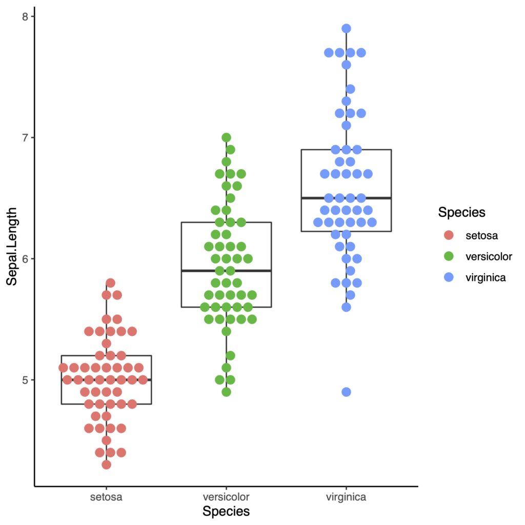
まあまあいいですが、このグラフではbeeswarmの良さが見えてこないかもしれません。下でもう少し別のセットを使って示してみます。
geom_quasirandomを使う
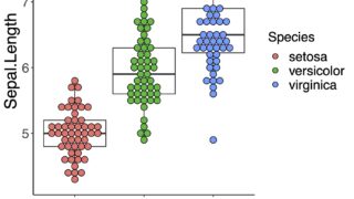
今度はggbeeswarmパッケージに入っているgeom_quasirandomを使ってみます
ggplot(a, aes(x = Species, y = Sepal.Length))+
  geom_boxplot(fill = "white")+
  geom_quasirandom()+
  theme_classic()
結構点がバラバラに表示をされました
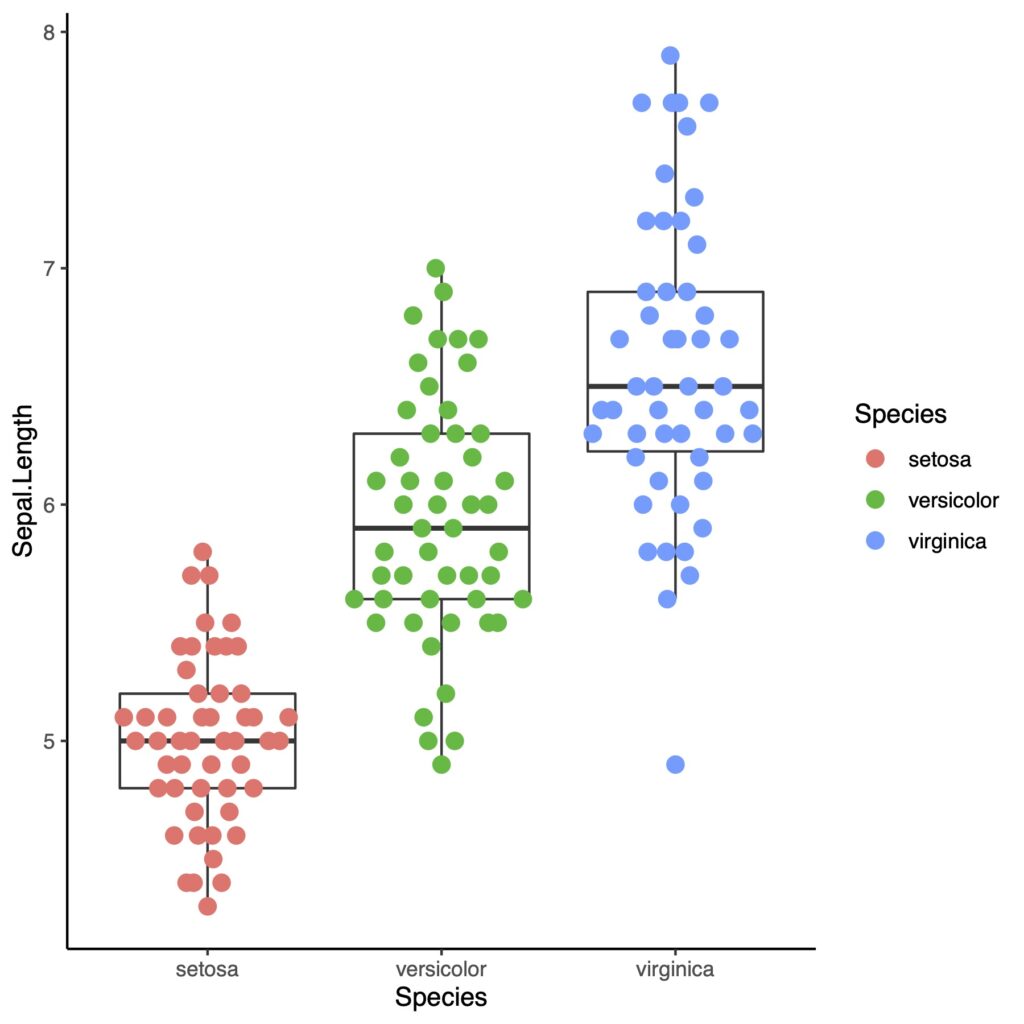
色と点の大きさを変えてみましょう
ggplot(a, aes(x = Species, y = Sepal.Length))+
  geom_boxplot(fill = "white")+
  geom_quasirandom(aes(color = Species), size = 3)+
  theme_classic()
methodによる違い
点の数は多いほうが、ggbeeswarmの特徴がよくわかります。rnormを使って、さらに点の数が多い分布を作ってみます。
dat <- list(
  X <- rnorm(150, 10, 10),
  Y <- rnorm(150, 25, 10),
  Z <- rnorm(150, 20, 15)
)
df <- data.frame(matrix(unlist(dat), nrow=150))
colnames(df) <- c("A","B","C")
df.long <- pivot_longer(df, cols = A:C, names_to = "Categories", values_to = "Values")
ではいってみましょう。pivot_longerの使い方はこちらから。

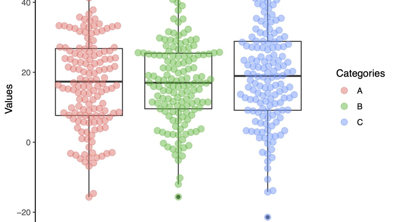
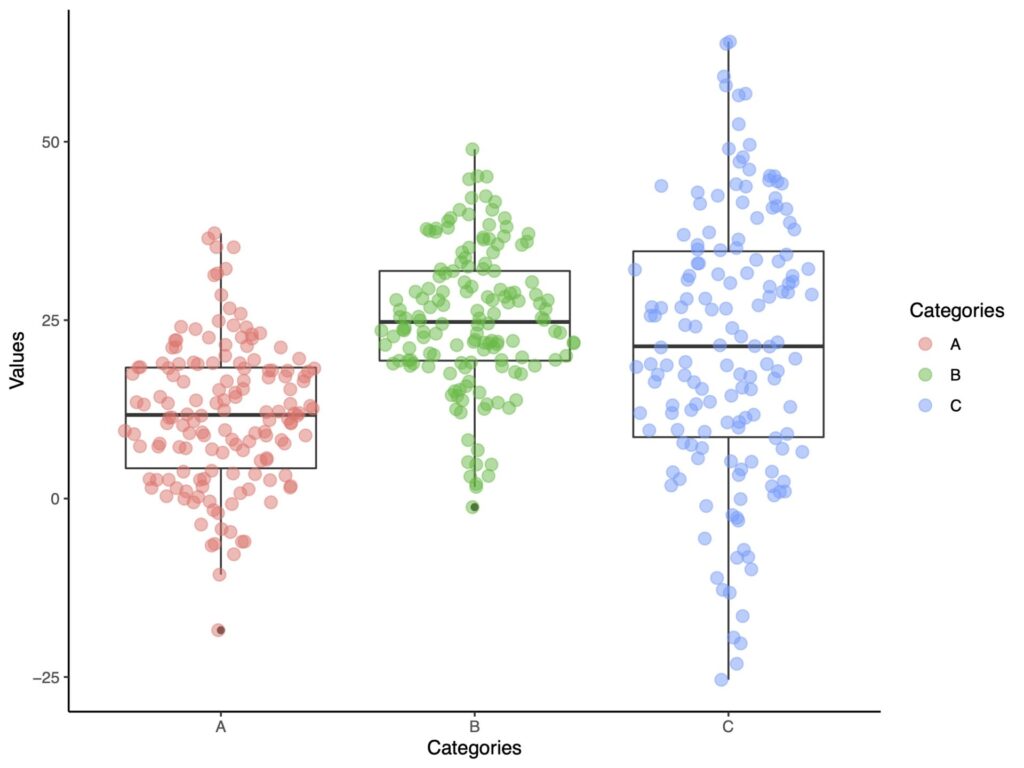
geom_beeswarm
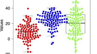
ggplot(df.long, aes(x=Categories, y = Values))+
  geom_boxplot(fill="white")+
  geom_beeswarm(aes(color = Categories),
                size = 3,
                cex = 2,
                alpha =.5)+
  theme_classic()
重なりを表示するためにalphaを指定して半透明にしています。
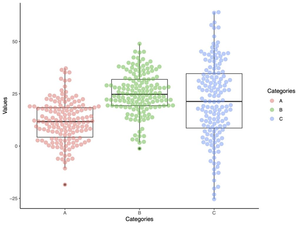
beeswarmの良さがみえてきました。十分発表や論文に使えるレベルだと思います。
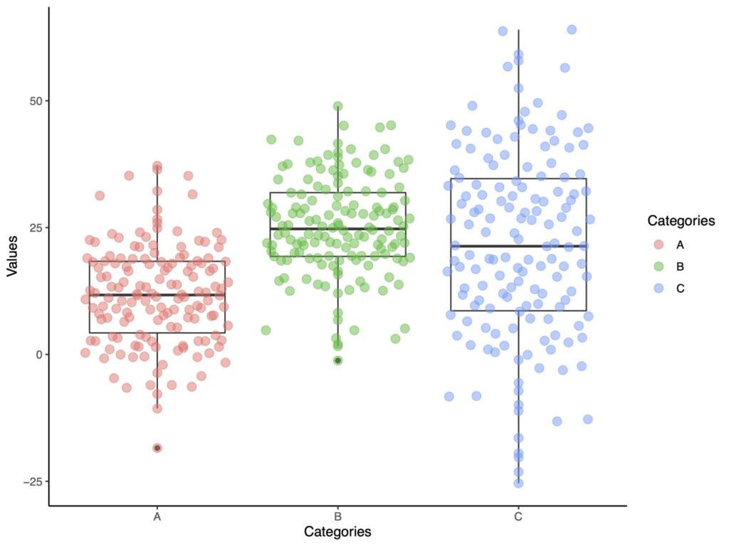
quasirandom
geom_quasirandomでいくつかのmethodを指定することができます。
まずはデフォルトです。
ggplot(df.long, aes(x=Categories, y = Values))+
  geom_boxplot(fill="white")+
  geom_quasirandom(aes(color = Categories),
                   size = 3,
                   alpha =.5)+
  theme_classic()

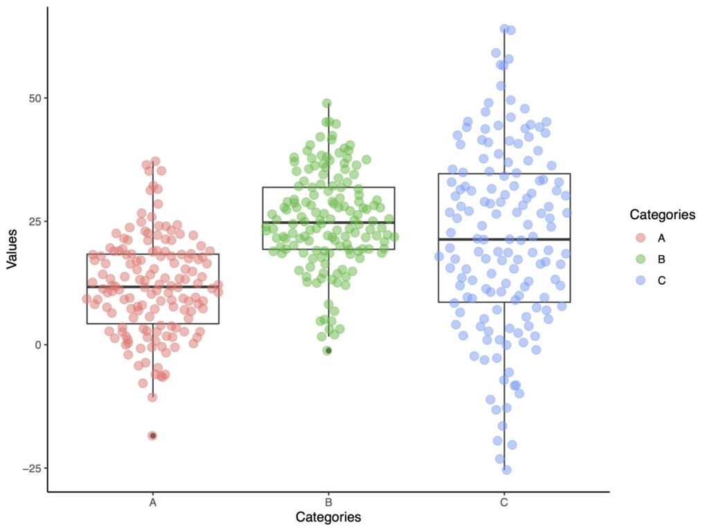
次は他のいくつかの方法を示していきます。
pseudorandom
ggplot(df.long, aes(x=Categories, y = Values))+
  geom_boxplot(fill="white")+
  geom_quasirandom(aes(color = Categories),
                   method ='pseudorandom',
                   size = 3,
                   alpha =.5)+
  theme_classic()
smiley
わかりやすい名前ですよね。
ggplot(df.long, aes(x=Categories, y = Values))+
  geom_boxplot(fill="white")+
  geom_quasirandom(aes(color = Categories),
                   method ='smiley',
                   size = 3,
                   alpha =.5)+
  theme_classic()

口角が上がっているようにみえます。
frowney
smileyとは反対に口角が下がっているような図になります。
ggplot(df.long, aes(x=Categories, y = Values))+
  geom_boxplot(fill="white")+
  geom_quasirandom(aes(color = Categories),
                   method ='frowney',
                   size = 3,
                   alpha =.5)+
  theme_classic()

おもしろい名前ですよね。
tukey
turkeyという方法です。
ggplot(df.long, aes(x=Categories, y = Values))+
  geom_boxplot(fill="white")+
  geom_quasirandom(aes(color = Categories),
                   method ='tukey',
                   size = 3,
                   alpha =.5)+
  theme_classic()
tukeyDense
最後にtukeyDenseを紹介します。
ggplot(df.long, aes(x=Categories, y = Values))+
  geom_boxplot(fill="white")+
  geom_quasirandom(aes(color = Categories),
                   method ='tukeyDense',
                   size = 3,
                   alpha =.5)+
  theme_classic()
ggplotをベースにしたggbeeswarmはキレイですね。お役に立ちましたら幸いです。