

ggplot2を使わずbeeswarmをつかったドットプロットをわかりやすく説明しました。とても簡単ですが、魅力的な図ができます。
これは私がまだRを触ったことがなかった時、自分が必要に迫られて短時間でドットプロットを書かなくてはいけなかった際、有料ソフトを購入するしかないと諦めていたときに無料で出来る見つけ使った方法です。
そのため、はじめてRを触った人でも真似をすれば出来る方法を紹介します。
ggplot2を使った方法を参照したい方はこちらを参照してください。
データセットの準備とbeeswarmのインストール
まずははじめに作業ディレクトリをセットします。
setwd("~/Rpractice/")
beeswarmのパッケージをインストールしましょう。
install.packages("beeswarm", dependencies = TRUE)
beeswarmを起動します。
library(beeswarm)
アヤメデータを使います。アヤメデータについてはこちらで説明をしています。
a <- iris
head(a)
> head(a)
  Sepal.Length Sepal.Width Petal.Length Petal.Width Species
1          5.1         3.5          1.4         0.2  setosa
2          4.9         3.0          1.4         0.2  setosa
3          4.7         3.2          1.3         0.2  setosa
4          4.6         3.1          1.5         0.2  setosa
5          5.0         3.6          1.4         0.2  setosa
6          5.4         3.9          1.7         0.4  setosa
>
アヤメデータがaに格納されました。これで準備ができました。
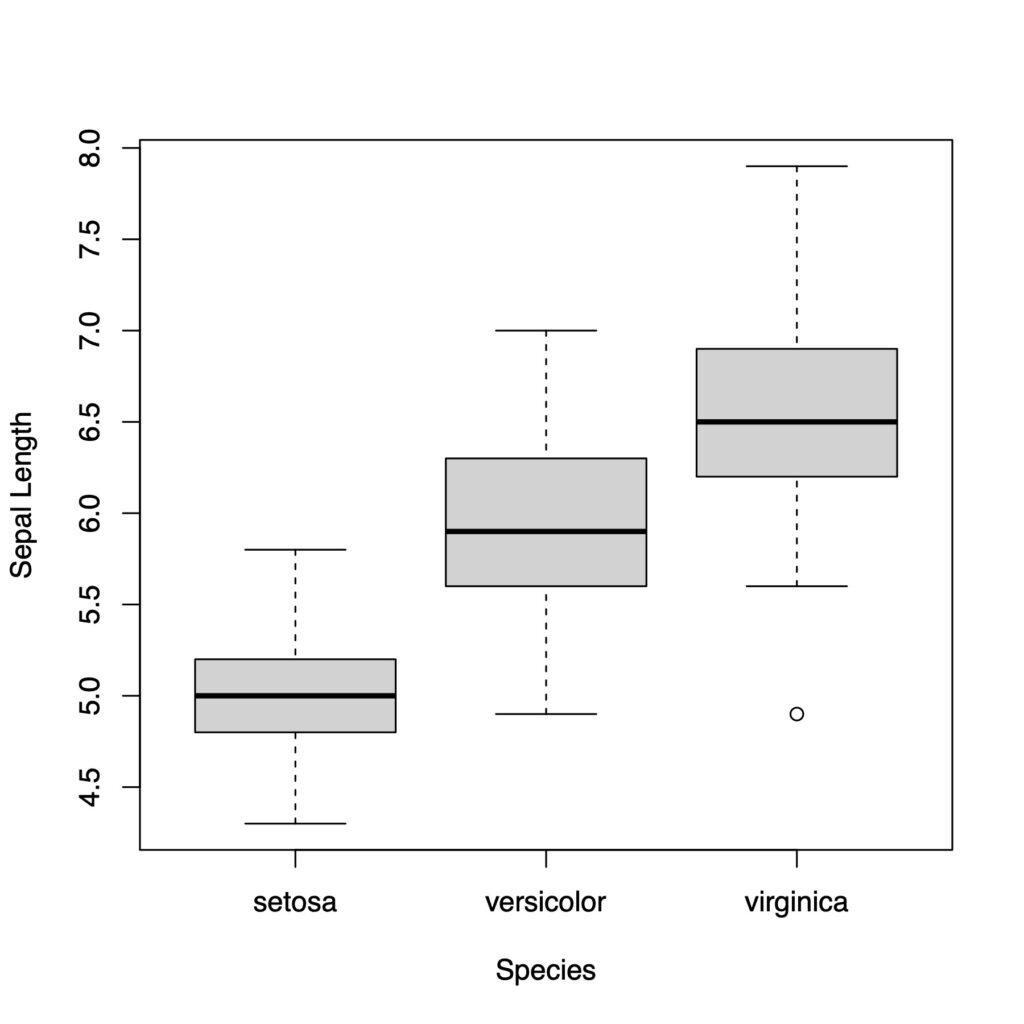
箱ひげ図を書く
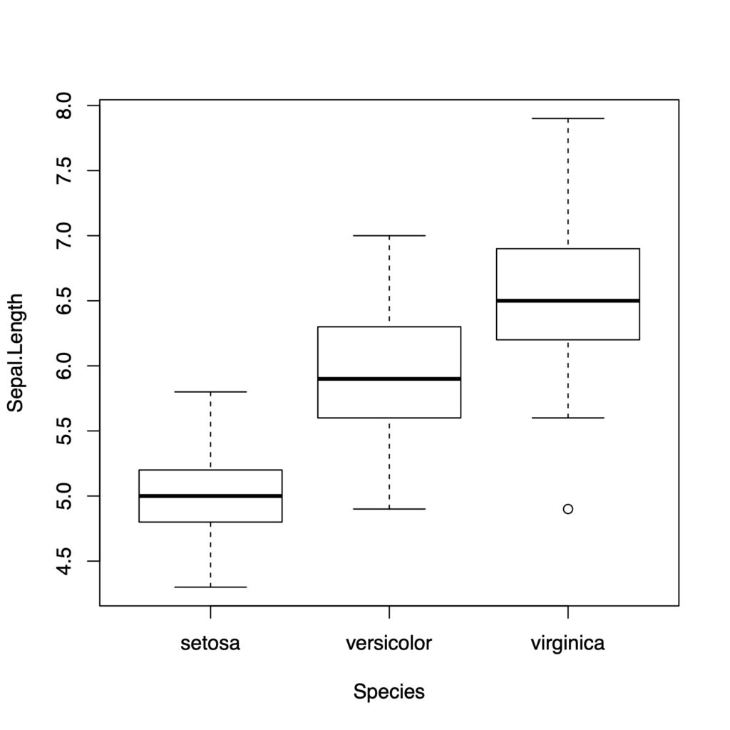
まずは単純な箱ひげ図をかいていきます
boxplot(a$Sepal.Length ~ a$Species)

ラベルをつけていきましょう
boxplot(a$Sepal.Length ~ a$Species,
        xlab = "Species", ylab = "Sepal Length")
箱ひげ図のかき方はこちらでもいいです。
boxplot(data = a, Sepal.Length ~ Species)
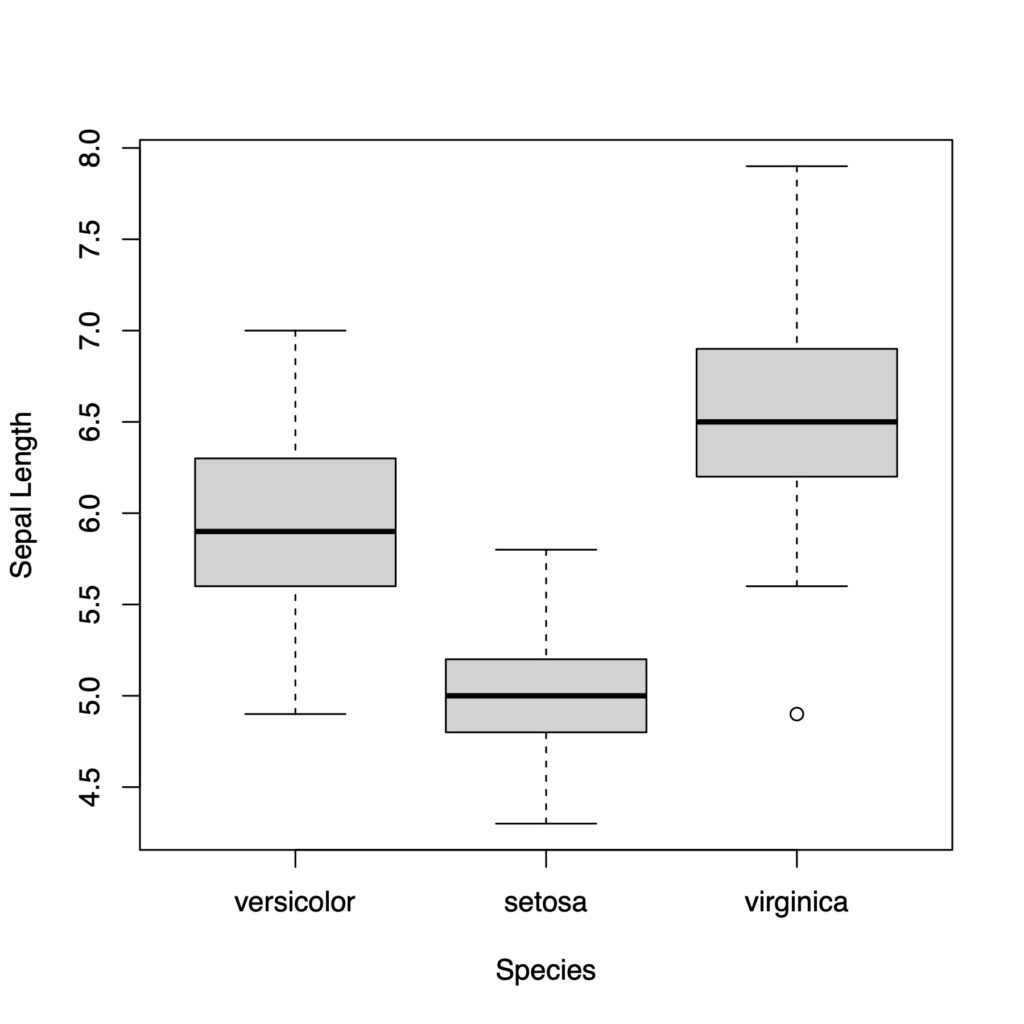
x軸の順番を変えたい時はfactorとlevelを追記します
x軸の順番を変える時、factor()の中にlevel=c()で下のように順番を指定します。
boxplot(a$Sepal.Length ~ factor(a$Species,
        level = c('versicolor', 'setosa', 'virginica')),
        xlab = "Species", ylab = "Sepal Length")
colで箱の中を白くします
boxplot(data = a, Sepal.Length ~ Species,
        col = "white")
lasで軸の文字の向きを変えることができます
boxplot(data = a, Sepal.Length ~ Species,
        col = "white", las = 1)

boxplot(data = a, Sepal.Length ~ Species,
        col = "white", las = 2)
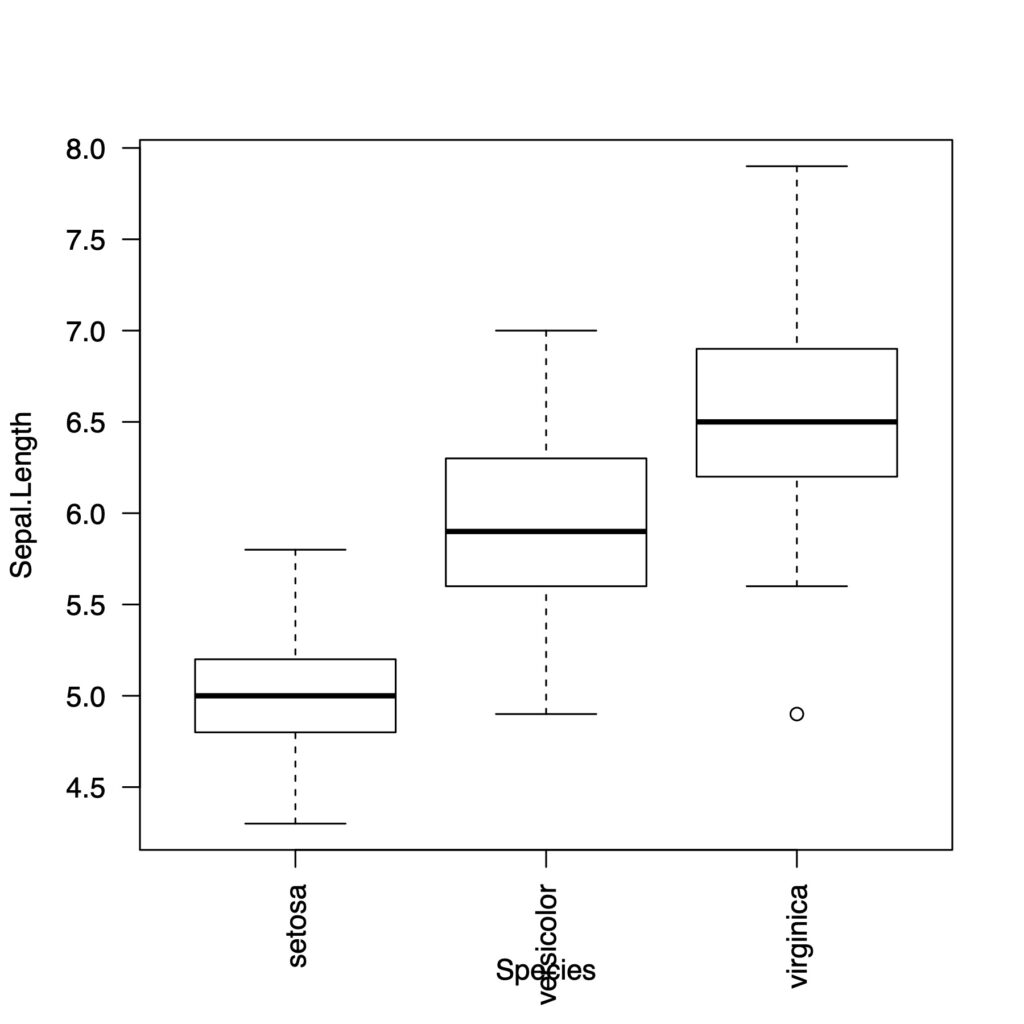
下の文字が重なってしまいましたね。
ボックスプロットを横向きにします
boxplot(data = a, Sepal.Length ~ Species,
        col = "white",
        horizontal = TRUE, las = 2)
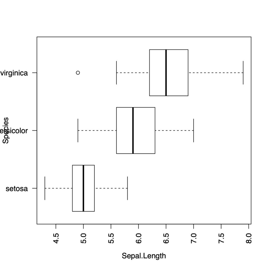
横の文字が重なったのと、2番目の文字列が長すぎてきれてしまいました。初心者向けの記事なので、シンプルにアノテーションをなしにして、また少し外側のスペースを増やしましょう。
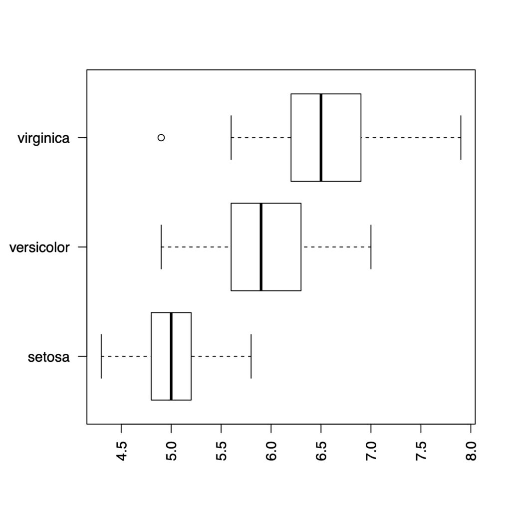
par(mar = c(5,5,4,2) + 0.1)  # default is c(5,4,4,2) + 0.1
boxplot(data = a, Sepal.Length ~ Species,
        col = "white",
        horizontal = TRUE, ann = FALSE, las = 2)
beeswarmを箱ひげ図にのせていく
beeswarmを使っていきます
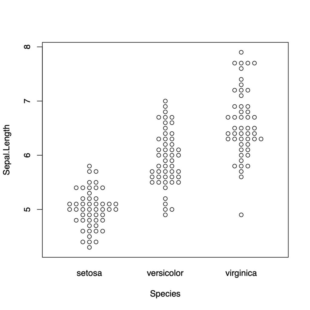
ようやくbeeswarmにたどり着きました。
beeswarm(data = a, Sepal.Length ~ Species)
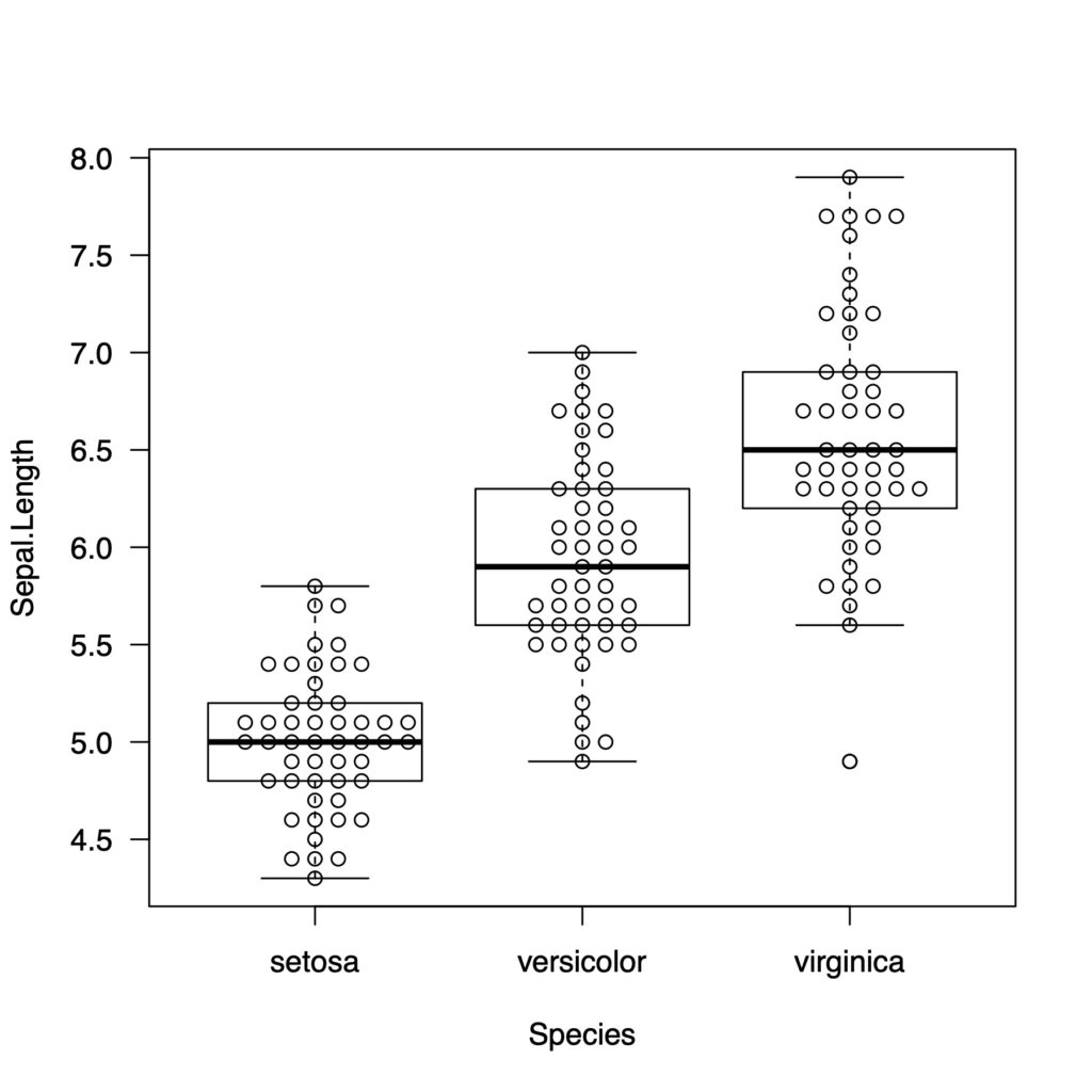
beeswarmでadd = TRUEとすると下の図に重ねることができます
boxplot(data = a, Sepal.Length ~ Species, col = "white", las = 1)
beeswarm(data = a, Sepal.Length ~ Species, add = TRUE)
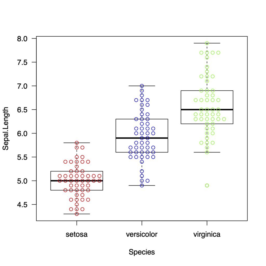
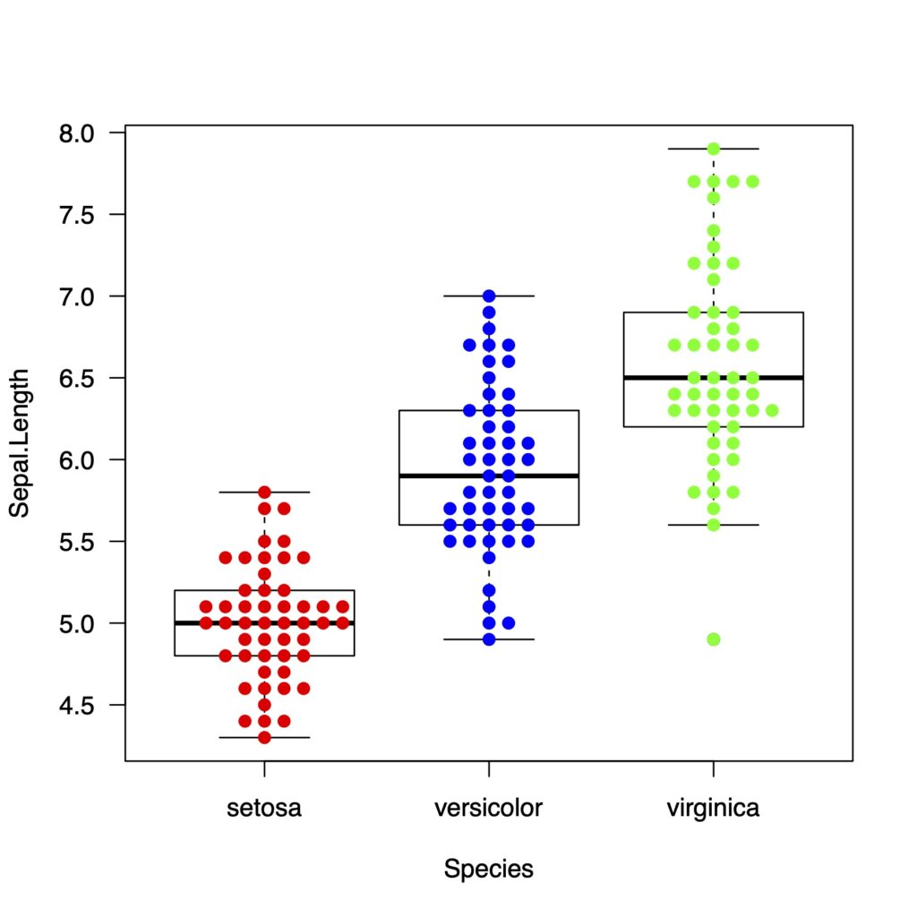
色をつけます
boxplot(data = a, Sepal.Length ~ Species, col = "white", las = 1)
beeswarm(data = a, Sepal.Length ~ Species,
         col = c("red","blue","green"),
         add = TRUE)
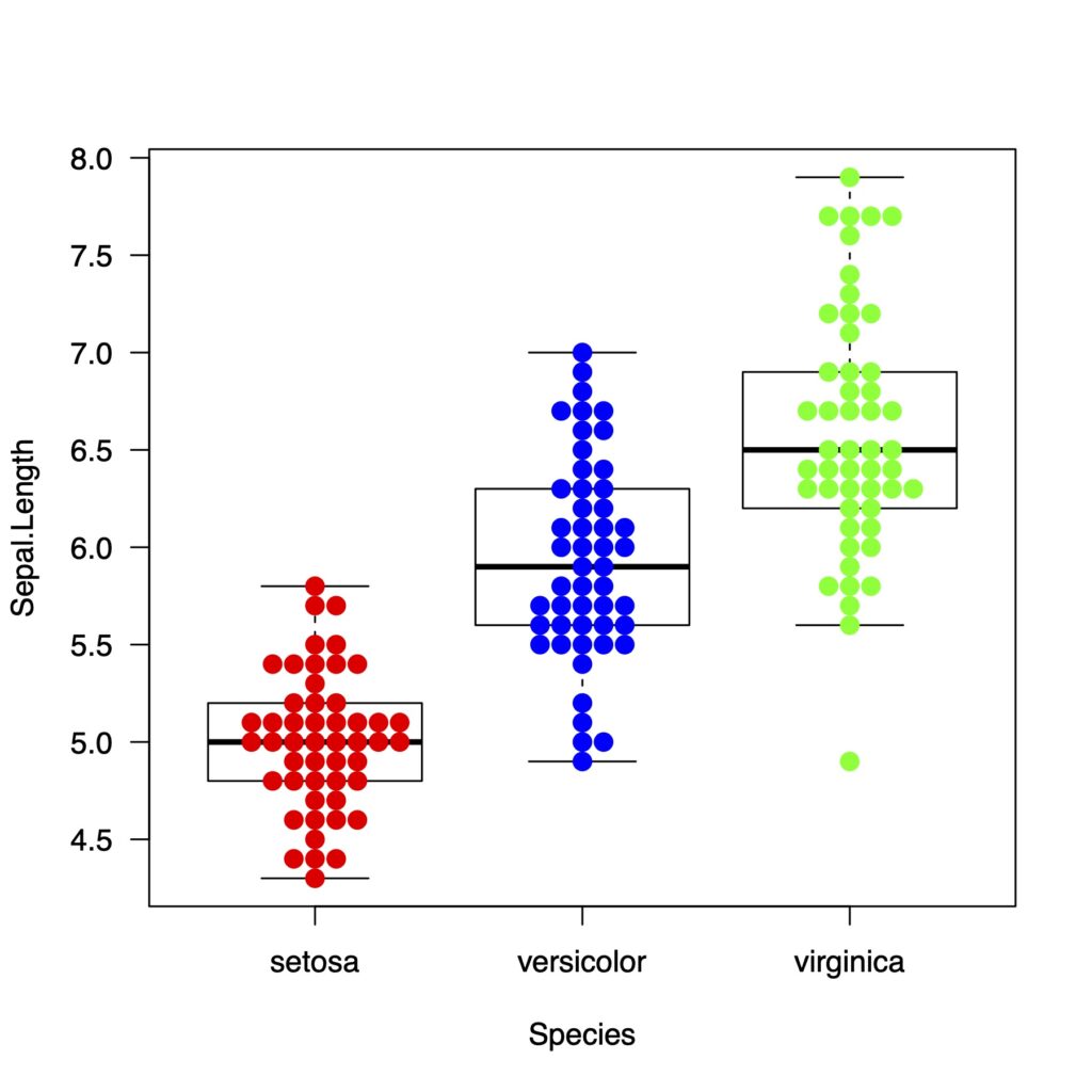
ドットのスタイルを変えるにはpchを指定します。
pchには25種類用意されています
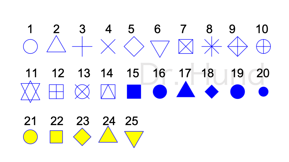
pchを19に指定してみます。好みで選んでください。ちなみに16と19の丸の違いですが、16は普通の丸、19は少し斜め方向に膨らんだような丸になっています。
boxplot(data = a, Sepal.Length ~ Species, col = "white", las = 1)
beeswarm(data = a, Sepal.Length ~ Species,
         col = c("red","blue","green"),
         pch = 19,
         add = TRUE)
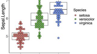
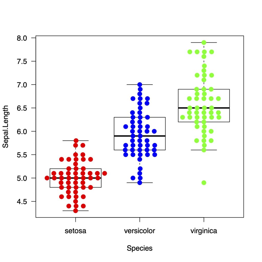
cexでドットの大きさを変えます。
boxplot(data = a, Sepal.Length ~ Species, col = "white", las = 1)
beeswarm(data = a, Sepal.Length ~ Species,
         method = "swarm",
         col = c("red","blue","green"),
         pch = 19,
         cex = 1.3,
         add = TRUE)

spacingで点と点の距離を変更できます
beeswarmのmethodは4つある
swarm, center, hex, squareの4つあります
boxplot(data = a, Sepal.Length ~ Species, col = "white", las = 1)
beeswarm(data = a, Sepal.Length ~ Species,
         method = "swarm",
         col = c("red","blue","green"),
         pch = 19,
         cex = 1.3,
         add = TRUE)
boxplot(data = a, Sepal.Length ~ Species, col = "white", las = 1)
beeswarm(data = a, Sepal.Length ~ Species,
         method = "center",
         col = c("red","blue","green"),
         pch = 19,
         cex = 1.3,
         add = TRUE)
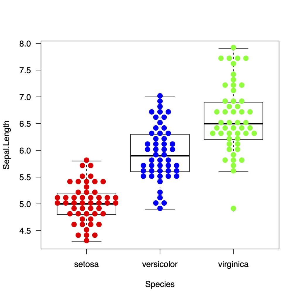
アヤメデータは小数点1桁までなので、methodによる違いがあまりはっきりしません。
rnormで乱数をつくってみます
x <- rnorm(100, 10, 10)
y <- rnorm(100, 25, 10)
z <- rnorm(100, 20, 15)
それぞれのmethodによるグラフの違いをみていきましょう
methodによる違い
もう一度methodの違いを見ていきます
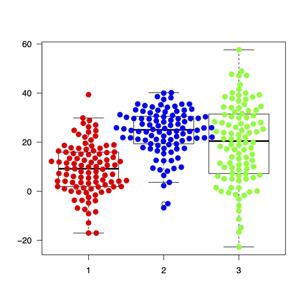
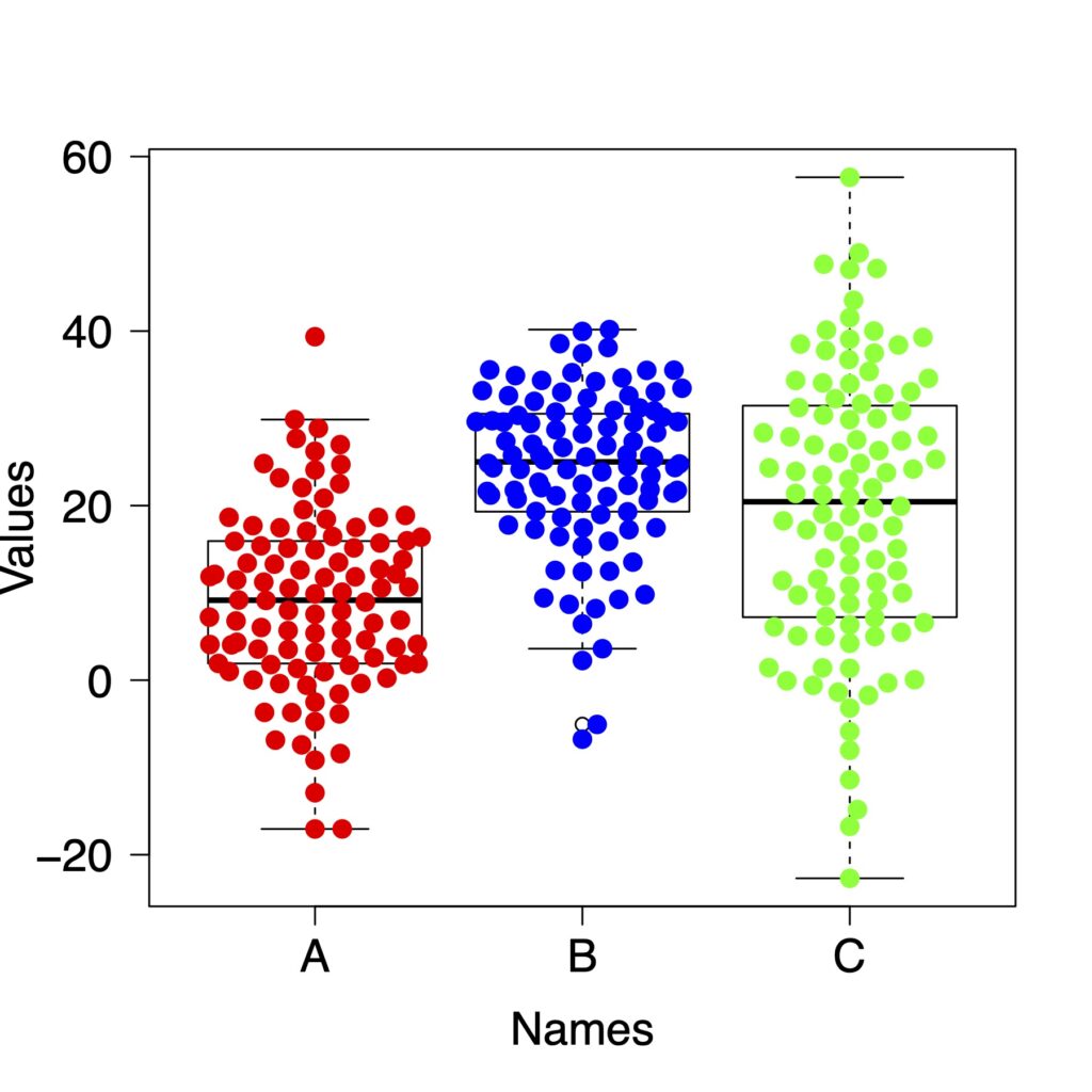
swarm
boxplot(list(x, y, z), col = "white", las = 1)
beeswarm(list(x, y, z),
         method = "swarm",
         col = c("red","blue","green"),
         spacing = 0.6,
         cex = 1.3,
         pch = 19,
         add = TRUE)
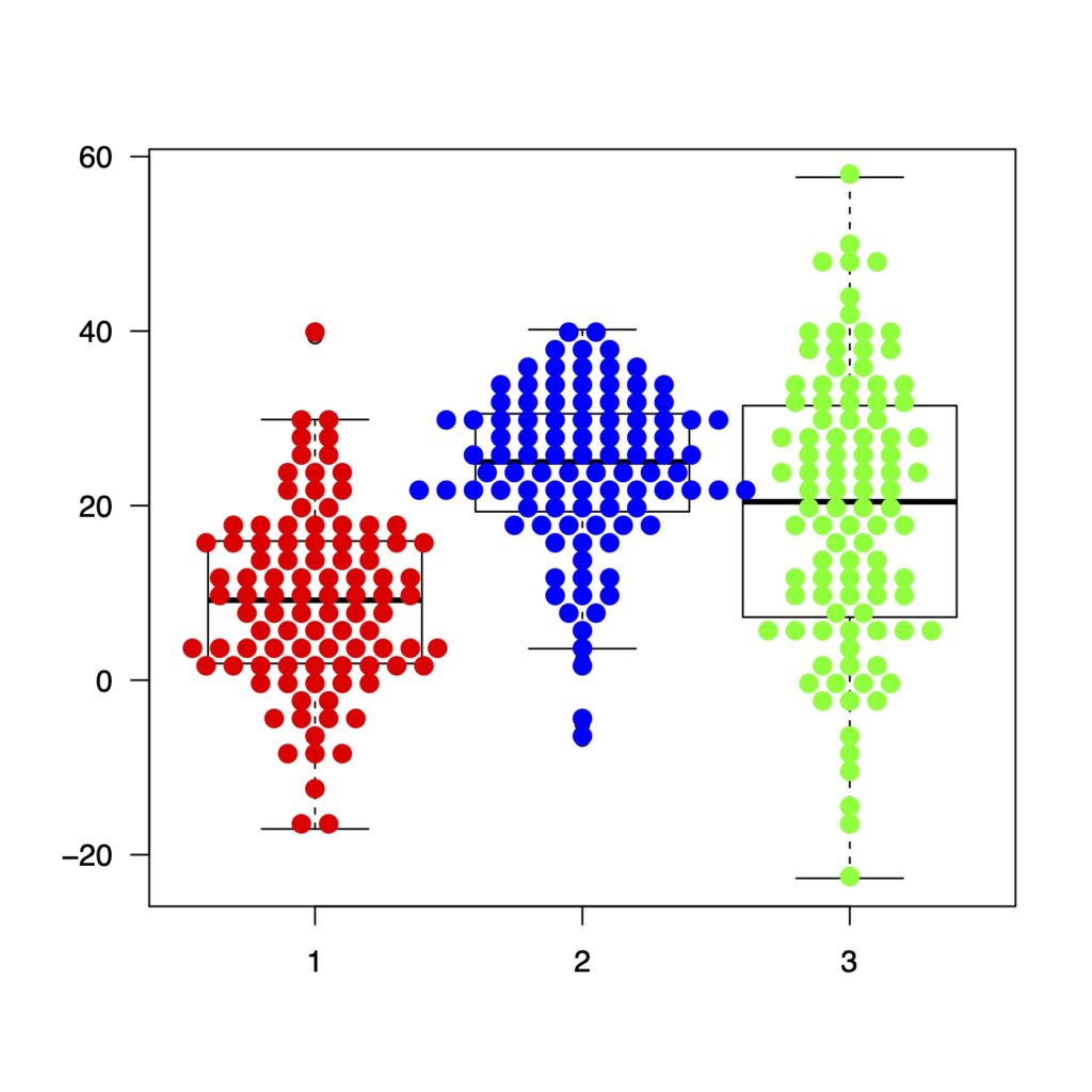
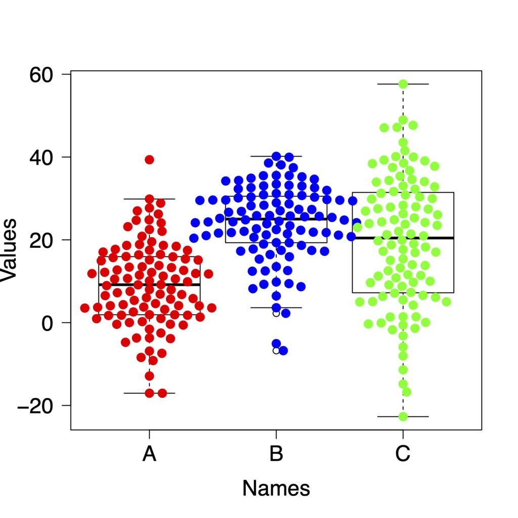
center
boxplot(list(x, y, z), col = "white", las = 1)
beeswarm(list(x, y, z),
         method = "center",
         col = c("red","blue","green"),
         spacing = 0.9,
         cex = 1.3,
         pch = 19,
         add = TRUE)
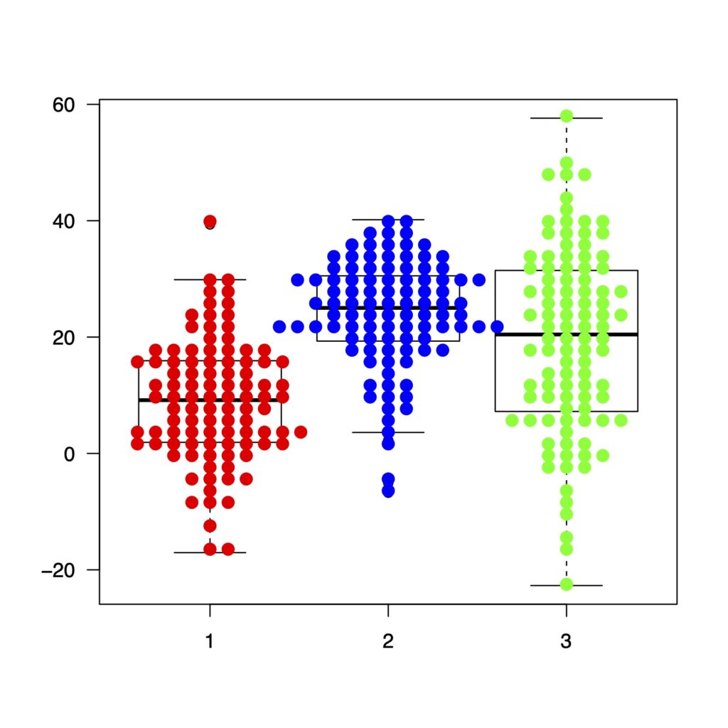
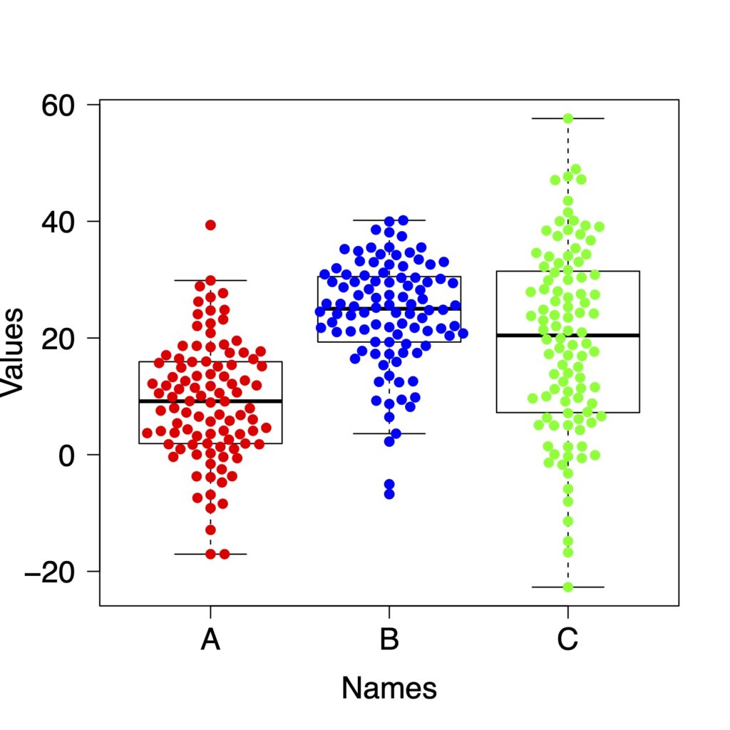
hex
boxplot(list(x, y, z), col = "white", las = 1)
beeswarm(list(x, y, z),
         method = "hex",
         col = c("red","blue","green"),
         spacing = .9,
         cex = 1.3,
         pch = 19,
         add = TRUE)

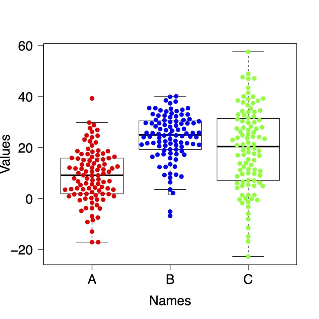
square
boxplot(list(x, y, z), col = "white", las = 1)
beeswarm(list(x, y, z),
         method = "square",
         col = c("red","blue","green"),
         cex = 1.3,
         spacing = .9,
         pch = 19,
         add = TRUE)
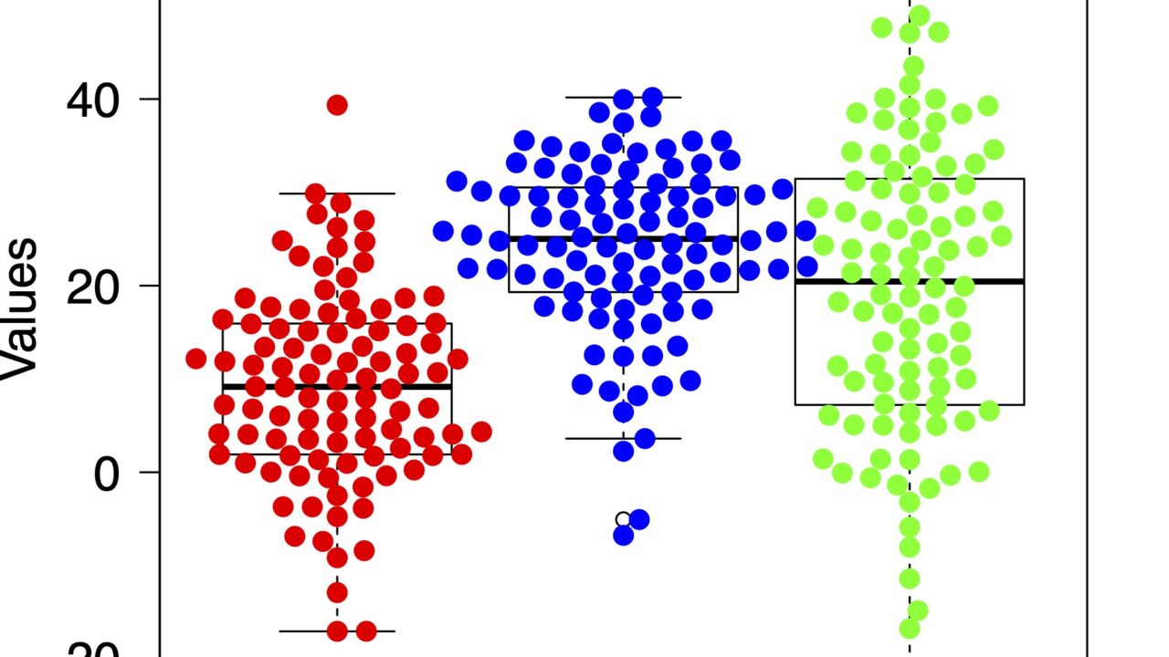
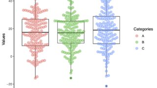
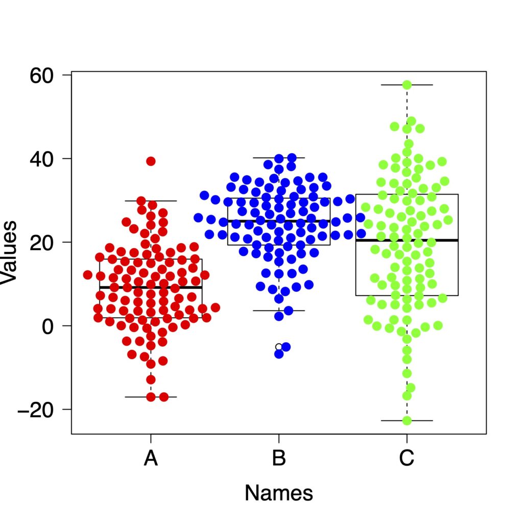
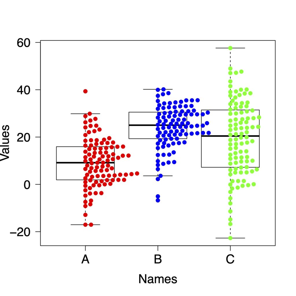
ラベルを変えてみます
boxplot(list(x, y, z),
        names = c("A", "B", "C"),
        xlab = "Names",
        ylab ="Values",
        col = "white",
        las = 1,
        cex.lab = 1.5,
        cex.axis = 1.5)
beeswarm(list(x, y, z),
         method = "swarm",
         col = c("red","blue","green"),
         pch = 19,
         spacing = .6,
         priority = "density",
         add = TRUE)
その他の機能を簡単に紹介します
corral
corralは点が大きく外側に外れたものを調整する方法です。
“none”, “gutter”, “wrap”, “random”, “omit”の5つの方法があります。
boxplot(list(x, y, z),
        names = c("A", "B", "C"),
        xlab = "Names",
        ylab ="Values",
        col = "white",
        las = 1,
        cex.lab = 1.5,
        cex.axis = 1.5)
beeswarm(list(x, y, z),
         method = "swarm",
         col = c("red","blue","green"),
         corral = "wrap",
         cex = 1.3,
         spacing = .9,
         pch = 19,
         add = TRUE)
priority
点の配置ですが、実際に見てみたほうがわかりやすいです。
descending
boxplot(list(x, y, z),
        names = c("A", "B", "C"),
        xlab = "Names",
        ylab ="Values",
        col = "white",
        las = 1,
        cex.lab = 1.5,
        cex.axis = 1.5)
beeswarm(list(x, y, z),
         method = "swarm",
         col = c("red","blue","green"),
         pch = 19,
         cex = 1.3,
         spacing = .9,
         priority = "descending",
         add = TRUE)
random
boxplot(list(x, y, z),
        names = c("A", "B", "C"),
        xlab = "Names",
        ylab ="Values",
        col = "white",
        las = 1,
        cex.lab = 1.5,
        cex.axis = 1.5)
beeswarm(list(x, y, z),
         method = "swarm",
         col = c("red","blue","green"),
         pch = 19,
         spacing = .9,
         priority = "random",
         add = TRUE)
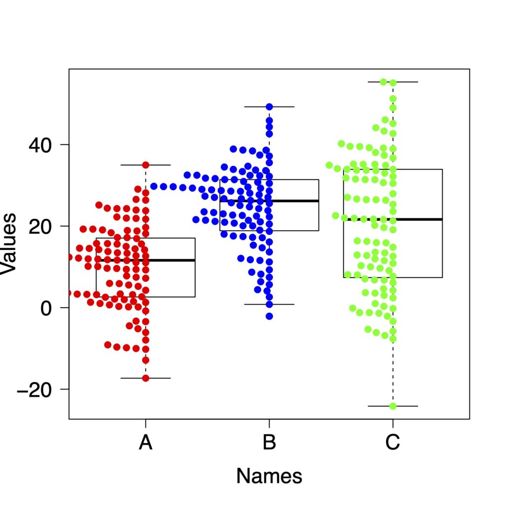
density
boxplot(list(x, y, z),
        names = c("A", "B", "C"),
        xlab = "Names",
        ylab ="Values",
        col = "white",
        las = 1,
        cex.lab = 1.5,
        cex.axis = 1.5)
beeswarm(list(x, y, z),
         method = "swarm",
         col = c("red","blue","green"),
         pch = 19,
         spacing = .9,
         priority = "density",
         add = TRUE)
side
点を右側か左側に集めます。
side = 1
右側に集めます。
boxplot(list(x, y, z),
        names = c("A", "B", "C"),
        xlab = "Names",
        ylab ="Values",
        col = "white",
        las = 1,
        cex.lab = 1.5,
        cex.axis = 1.5)
beeswarm(list(x, y, z),
         method = "swarm",
         col = c("red","blue","green"),
         pch = 19,
         spacing = .9,
         side = 1,
         add = TRUE)
side = -1
左側に集めます。
boxplot(list(x, y, z),
        names = c("A", "B", "C"),
        xlab = "Names",
        ylab ="Values",
        col = "white",
        las = 1,
        cex.lab = 1.5,
        cex.axis = 1.5)
beeswarm(list(x, y, z),
         method = "swarm",
         col = c("red","blue","green"),
         pch = 19,
         spacing = .9,
         side = -1,
         add = TRUE)
無料のオープンソースでここまでできるのはすごいですよね。
ggplot2とggbeeswarmを使った方法はこちらで紹介をしています。
どちらがいいかは好みですので、どちらでも使いやすいほうを使うのがいいと思います。
お役に立ちましたら幸いです。