

相関の図を書くときに何のソフトを使っているでしょうか?
ggplot2を使えば無料でより見栄えの良い図を書くことができます
それでは早速いってみましょう
データの準備
他の記事と同様に作業ディレクトリを設定して、ggplot2をいれます
なにかと便利なtidyverseを使っていきます
setwd("~/OneDrive/blog/Rpractice/")
library(tidyverse)
a <- iris
head(a)

>head(a)
  Sepal.Length Sepal.Width Petal.Length Petal.Width Species
1          5.1         3.5          1.4         0.2  setosa
2          4.9         3.0          1.4         0.2  setosa
3          4.7         3.2          1.3         0.2  setosa
4          4.6         3.1          1.5         0.2  setosa
5          5.0         3.6          1.4         0.2  setosa
6          5.4         3.9          1.7         0.4  setosa
>
準備ができました
がく片の長さとがく片の幅には相関があるかどうかみてみましょう
ここではまず実際のデータの分布をみてみましょう
散布図(scatter plot)の書き方
まずは散布図を書いてみましょう
ggplot(a, aes(x = Sepal.Length, y = Sepal.Width)) +
  geom_point()
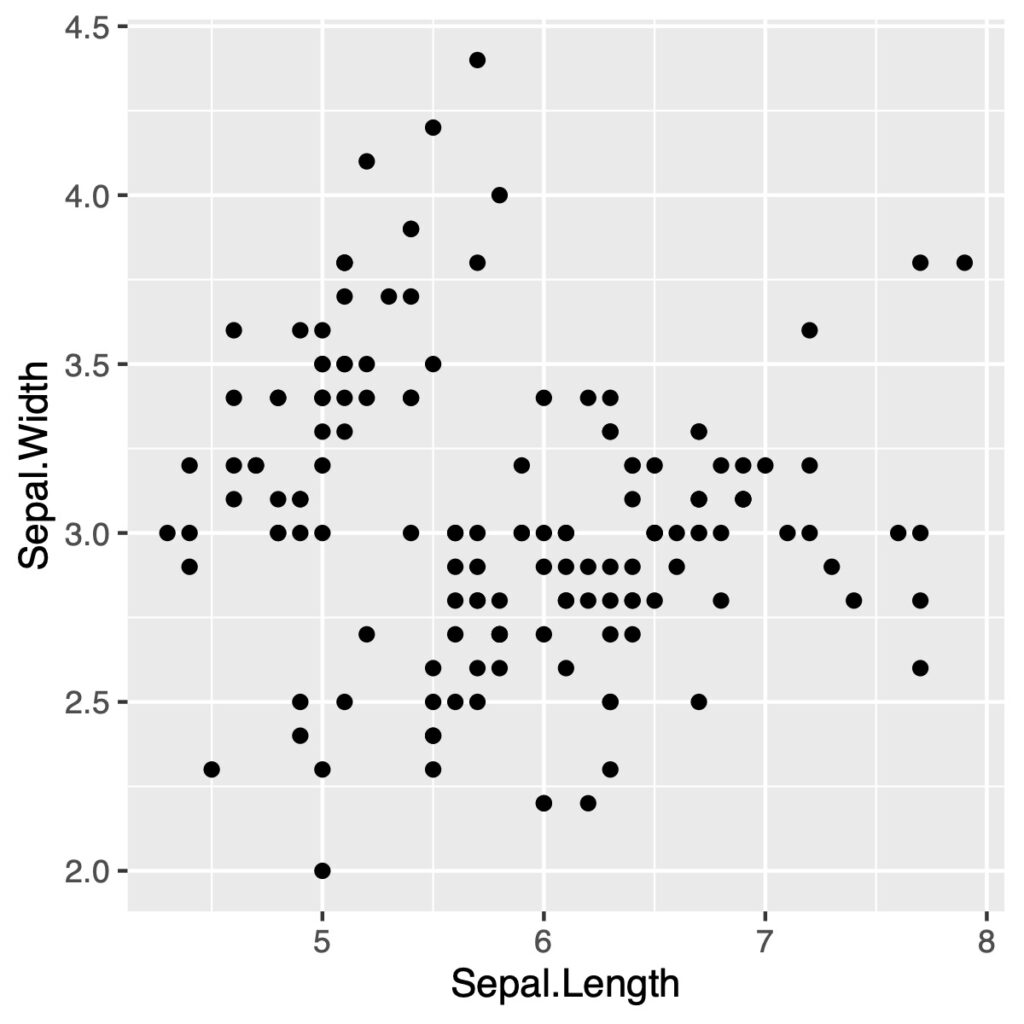
パッと見た感じ相関はありそうですが、島ができているのでこのまま単純に相関係数を出すことに意味はなさそうです
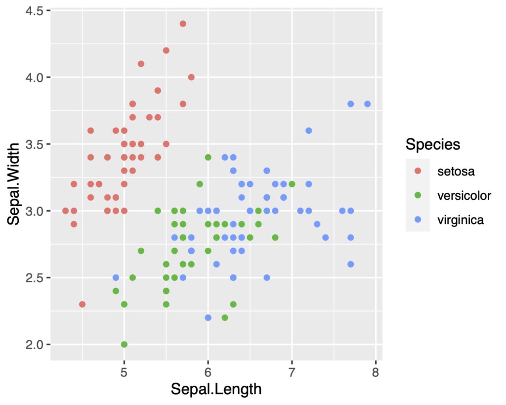
種類ごと色分けをする
一度種類によって色分けをするのがよさそうですね
ggplot(a, aes(x = Sepal.Length, y = Sepal.Width,
              color = Species)) +
  geom_point()
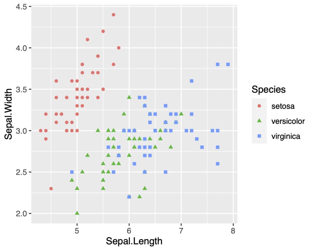
他の人にみてもらうためのグラフは、
色盲の方でも判別できるものを心がけなくてはいけません
shapeも変えたり工夫することが大切です
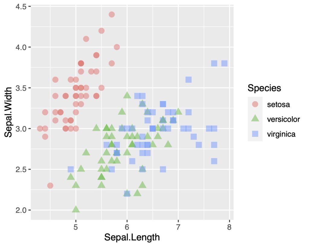
種類ごとに形を変える
shapeで形を種類ごとに変えてみます
ggplot(a, aes(x = Sepal.Length, y = Sepal.Width,
              shape = Species , color = Species)) +
  geom_point()
geoms_pointでsizeとalphaを指定して点の大きさと透明度を変更できます
ggplot(a, aes(x = Sepal.Length, y = Sepal.Width,
              shape = Species , color = Species)) +
  geom_point(size = 3, alpha = .5)
近似曲線や近似直線を加える
geom_smoothまたはstat_smoothで近似曲線を表示できます
seは信頼区間を表示するかどうかです(ここでは非表示にします)
またtheme_classicで背景を白くします
ggplot(a, aes(x = Sepal.Length, y = Sepal.Width,
              shape = Species , color = Species)) +
  geom_point(size = 5, alpha = .5)+
  geom_smooth(se = FALSE)+
  theme_classic()
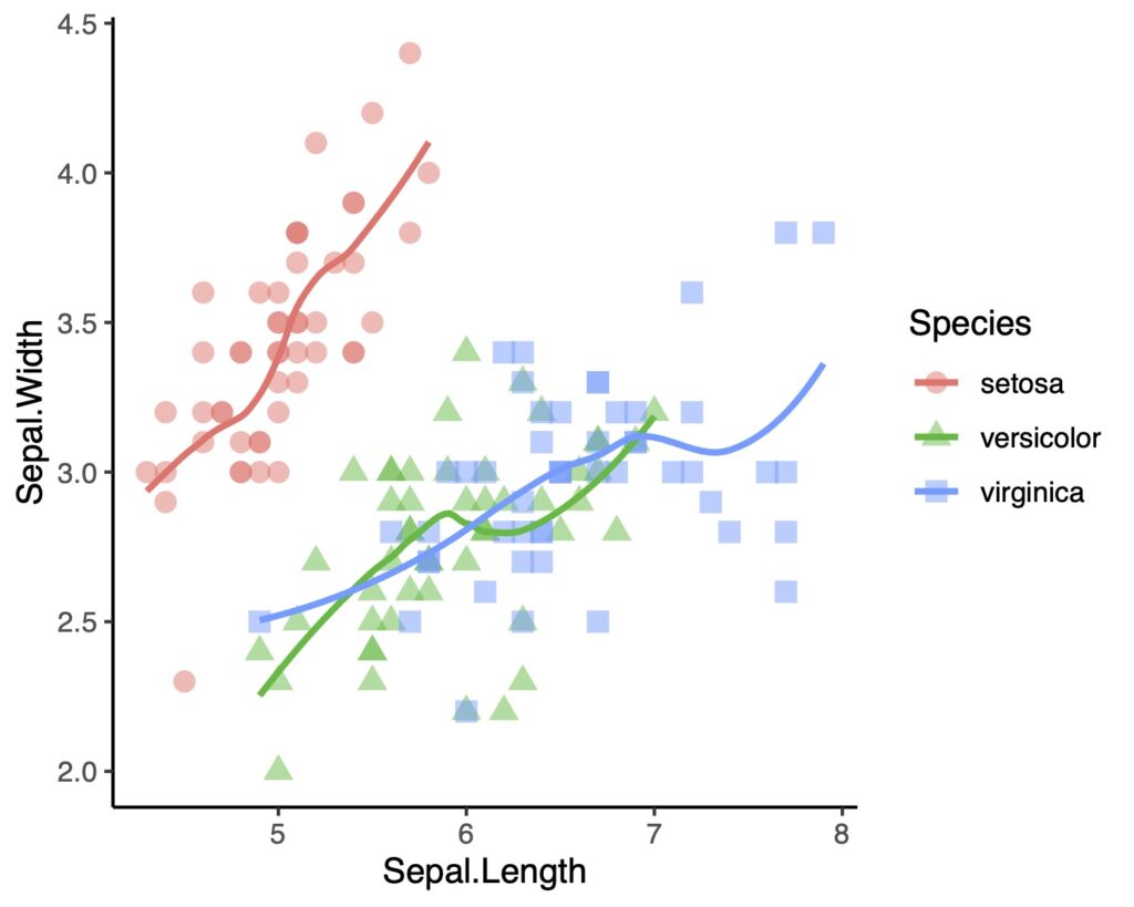
線形近似でもよさそうですね
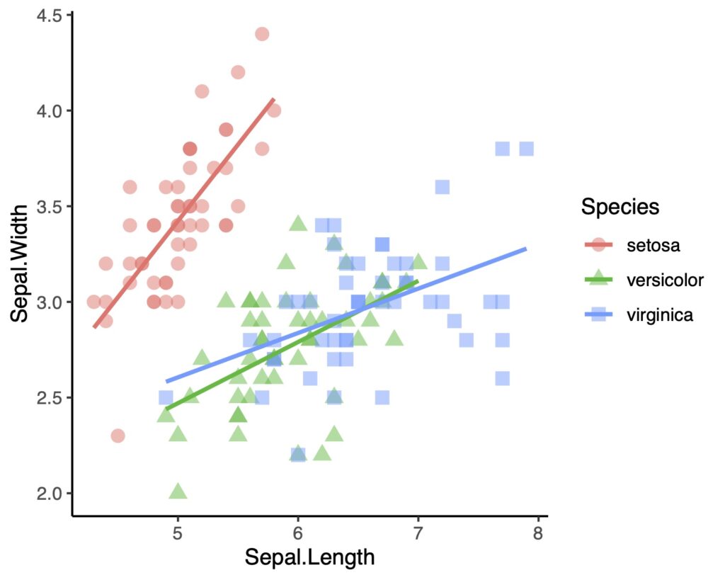
geom_smoothのmethodでlmを指定します
ggplot(a, aes(x = Sepal.Length, y = Sepal.Width,
              shape = Species , color = Species)) +
  geom_point(size = 3, alpha = .5)+
  geom_smooth(method = lm, se = FALSE)+
  theme_classic()
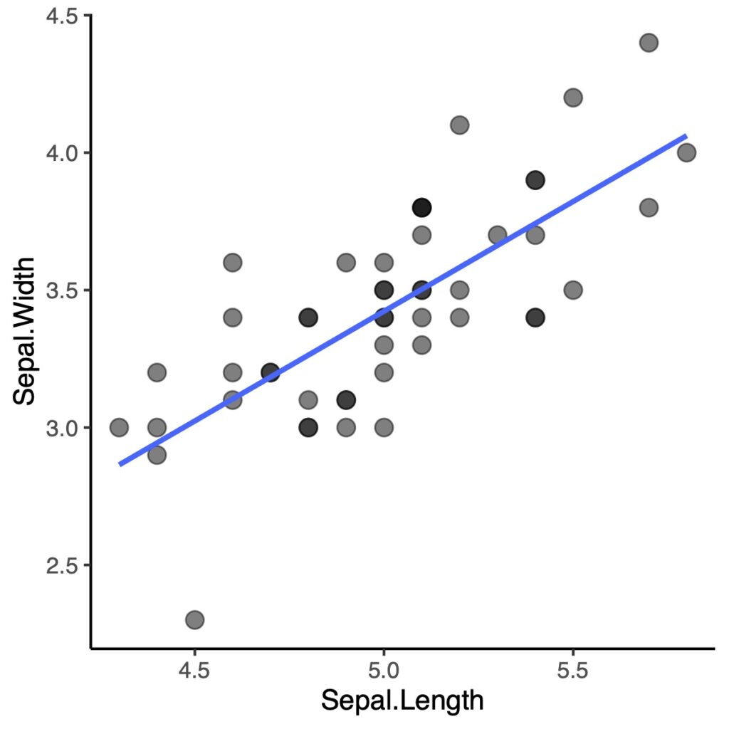
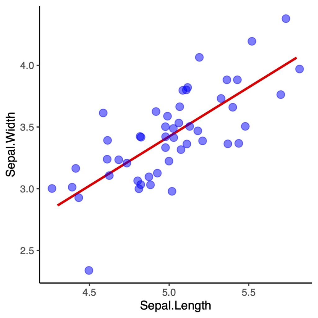
一種類のみを表示してみましょう
tidyverseの中になるdplyrの機能の一つ、filterを使ってみます
b <- filter(a, Species == "setosa")
view(b)
Speciesの列がsetosaだけになっていましたでしょうか?
それでは表示をしてみましょう
ggplot(b, aes(x = Sepal.Length, y = Sepal.Width)) +
  geom_point(size = 3, alpha = .5)+
  geom_smooth(method = lm, se = FALSE)+
  theme_classic()
geom_jitterで点同士の重なりをずらすことができます
ggplot(b, aes(x = Sepal.Length, y = Sepal.Width)) +
  geom_smooth(method = lm, se = FALSE, colour = "red")+
  geom_jitter(colour="blue", size = 3, alpha = .5)+
  theme_classic()
どの程度ずらすか指定できます
ggplot(b, aes(x = Sepal.Length, y = Sepal.Width)) +
  geom_smooth(method = lm, se = FALSE, colour = "red")+
  geom_jitter(colour="blue", size = 3, alpha = .5,
              width = 0.2, height = 0.2)+
  theme_classic()
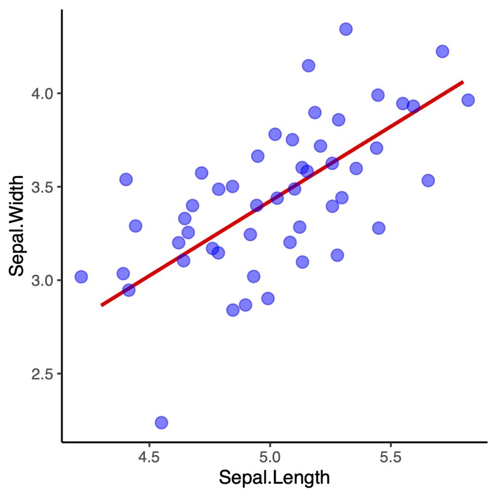
geom_jitterでは正確な点の配置ではなくなります
特に論文などの場合には使う場面に注意をしてください
geom_pointに戻して、geom_smoothのseをTRUEにしてみます
ggplot(b, aes(x = Sepal.Length, y = Sepal.Width)) +
  geom_smooth(method = lm, se = TRUE, colour = "red")+
  geom_point(colour="blue", size = 3, alpha = .5)+
  theme_classic()
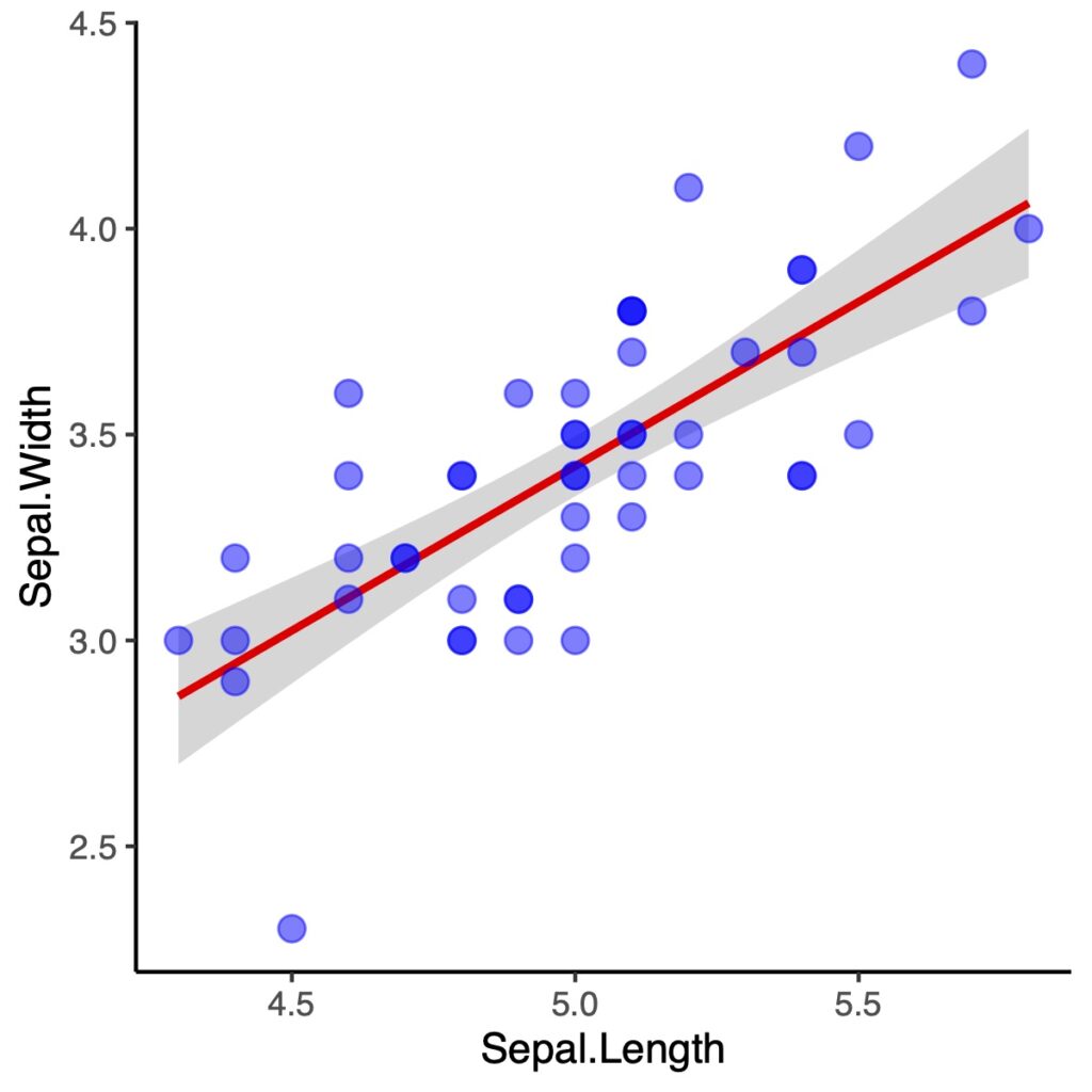
結構いいですよね
点を半透明にするメリットは重なりを濃淡で表示できることです
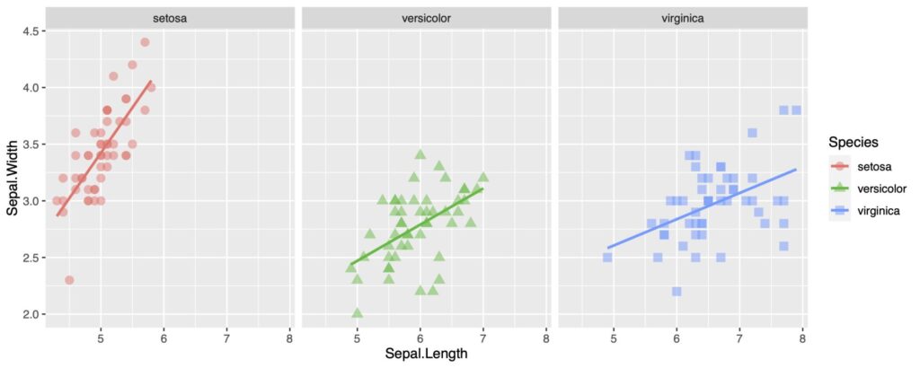
facet_gridを使って複数のグラフを表示
acet_gridやfacet_wrapは一度に複数のグラフを表示するのに便利です
ggplot(a, aes(x = Sepal.Length, y = Sepal.Width,
              shape = Species , color = Species)) +
  geom_point(size = 3, alpha = .5)+
  geom_smooth(method = lm, se = FALSE)+
  facet_grid(. ~ Species)
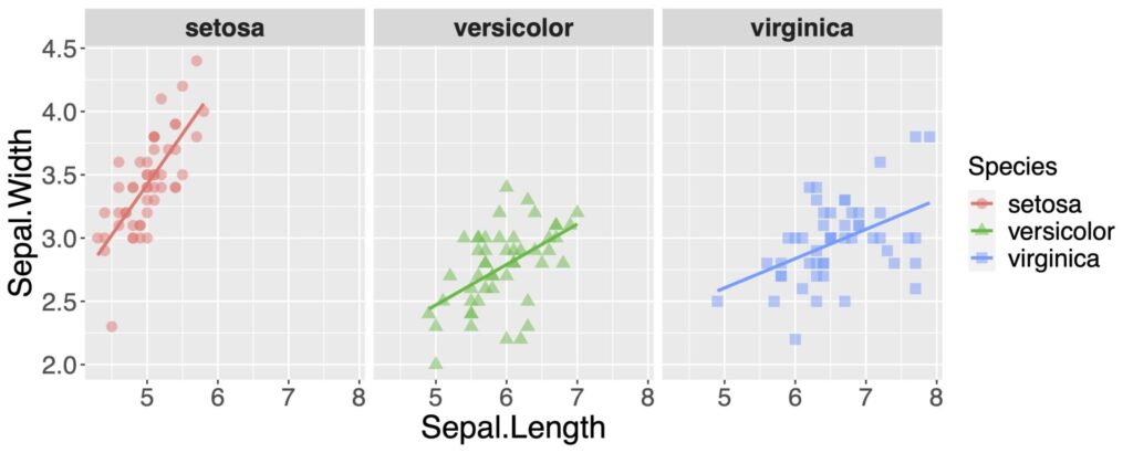
ラベルの文字の大きさを調整します
ggplot(a, aes(x = Sepal.Length, y = Sepal.Width,
              shape = Species , color = Species)) +
  geom_point(size = 5, alpha = .5)+
  geom_smooth(method = lm, se = FALSE)+
  facet_grid(. ~ Species)+
  theme(strip.text.x = element_text(size=16, face="bold"),
        axis.text.x = element_text(size = 16),
        axis.text.y = element_text(size = 16),
        axis.title.x = element_text(size = 20),
        axis.title.y = element_text(size = 20),
        legend.title = element_text(size=16),
        legend.text = element_text(size=16))
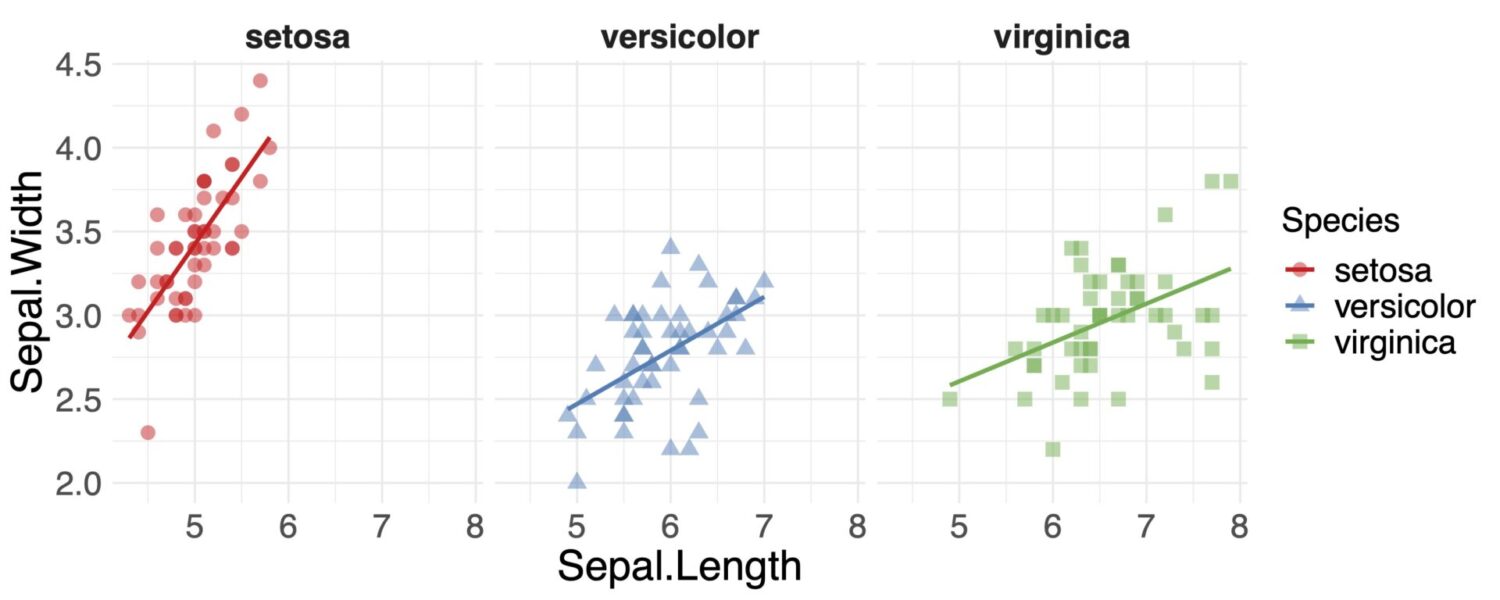
scale_color_brewerで色を変えてみます
scale_color_manualなどで個別に指定などもできます
背景を今回はtheme_minimal()にもしてみます
ggplot(a, aes(x = Sepal.Length, y = Sepal.Width,
              shape = Species , color = Species)) +
  geom_point(size = 3, alpha = .5)+
  geom_smooth(method = lm, se = FALSE)+
  scale_color_brewer(palette = "Set1")+
  facet_grid(. ~ Species)+
  theme_minimal()+
  theme(strip.text.x = element_text(size=16, face="bold"),
        axis.text.x = element_text(size = 16),
        axis.text.y = element_text(size = 16),
        axis.title.x = element_text(size = 20),
        axis.title.y = element_text(size = 20),
        legend.title = element_text(size=16),
        legend.text = element_text(size=16))
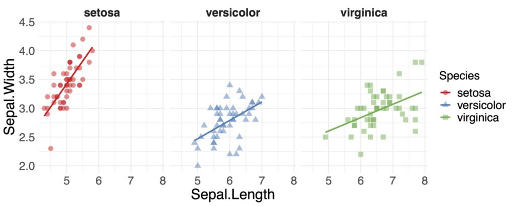
見やすくなりましたね
ggplot2に慣れてしまえば、いいグラフができます
しかも無料でできますので、覚えて損はないですよ